The minimalist-style cafe, Rosier at Thai Ha, has gradually come into operation, attracting a considerable number of customers. This is a passionately dedicated project by the design team at Ken Design, with a skillful and meticulous design and construction process. Let's join us in admiring the stunning images of Construction Rosier at Thai Ha right away!
Rosier - From Design to Reality
From the design phase to the completion of the project, Rosier always bears the mark of meticulousness and careful consideration from the Ken Design design team. As a minimalist-style cafe - a relatively new style in the field of cafe design and construction in Vietnam - Rosier demands high requirements in terms of layout, colors, lighting, and even interior details. Everything within the cafe's space needs to embody a spirit of simplicity while still providing all the necessary amenities for a functioning cafe.
Exterior Construction of Rosier Cafe
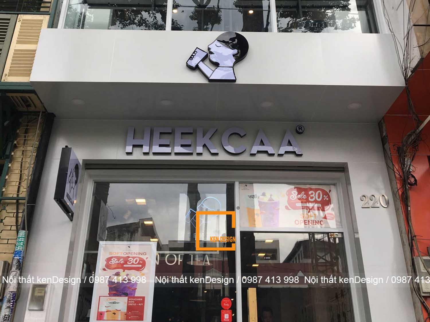
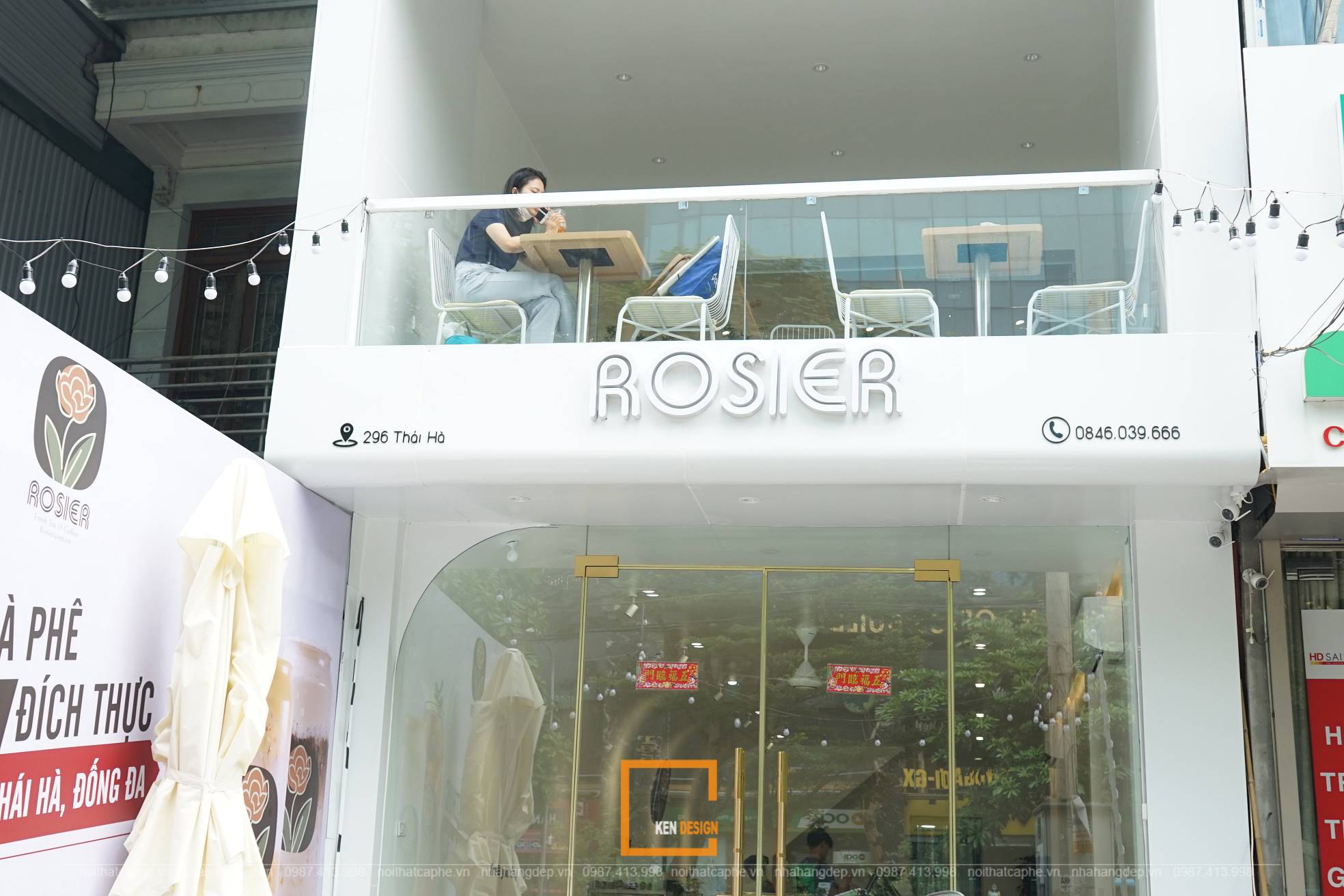
The exterior of Rosier Cafe features a fairly simple design to ensure convenient customer movement when entering and leaving the cafe. The cafe's brand name, along with contact information such as the phone number and Facebook page, is prominently displayed right in the center of the facade, making it easy for customers to identify the location of Rosier.
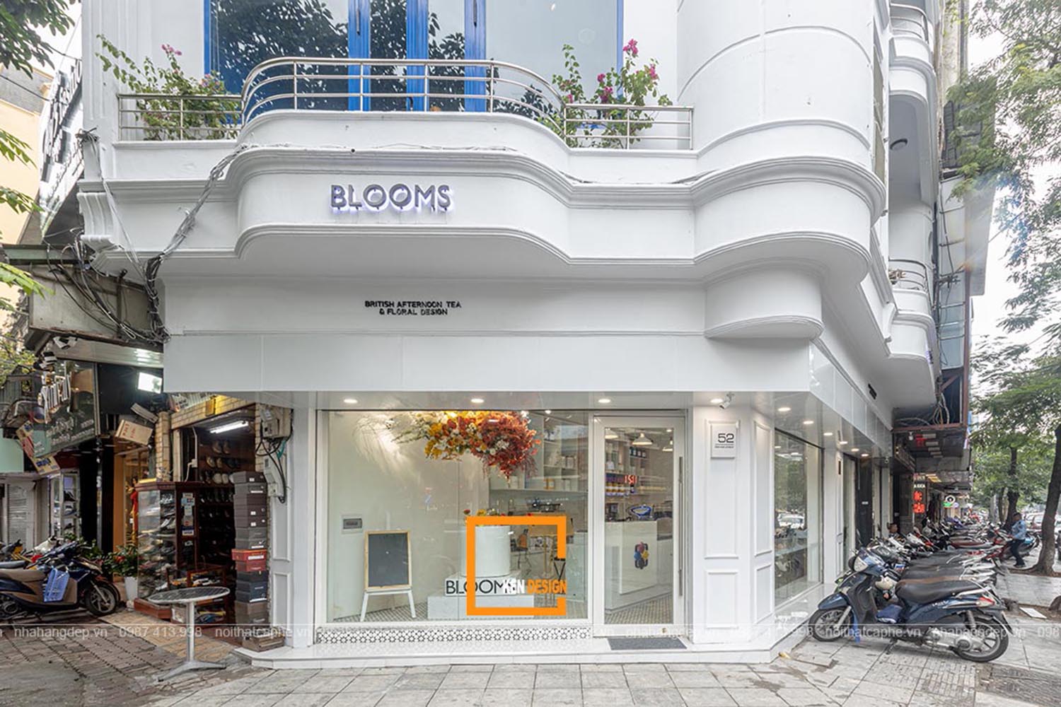
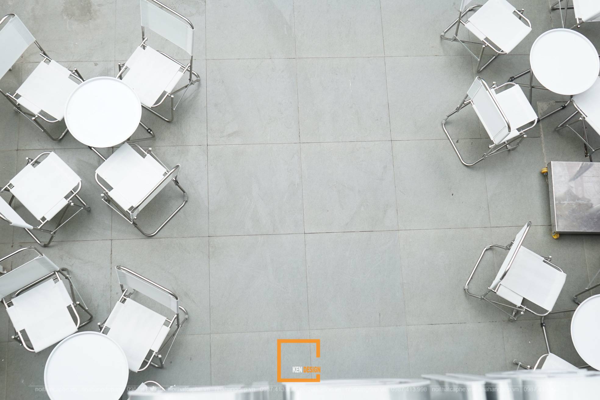
Due to the limited exterior space, we arranged four small sets of tables and chairs to serve customers who wish to enjoy the outdoor atmosphere. The dominant color tone of Rosier's minimalist design is elegant white, unified and harmonious with the interior. The thick glass doors not only provide sound insulation but also create an open space for the cafe, expanding the area and addressing space constraints.

Interior Construction
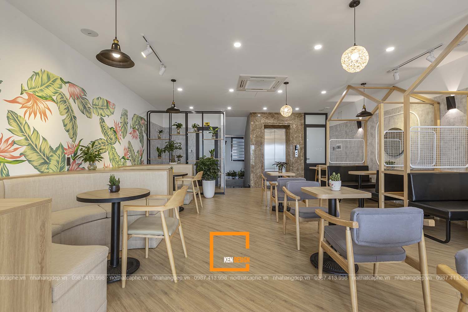
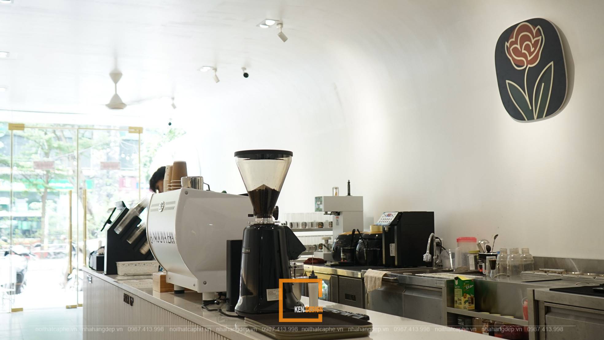
The interior of the ground floor follows the minimalist cafe design. The primary color scheme of Rosier is white and light gray, with gentle contrasts from the ambient lighting created by globe-shaped and recessed ceiling lights. Tables and chairs are arranged along both sides of the walls, saving space while maintaining a balanced and harmonious layout. A highlight of the ground floor is the impressive coffee preparation counter. The execution ensured the integrity of the design in this aspect, making Rosier shine and captivate visitors from their first step into the cafe.
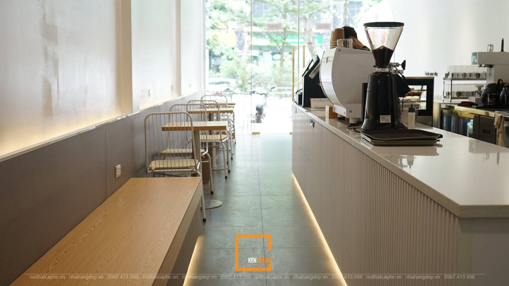
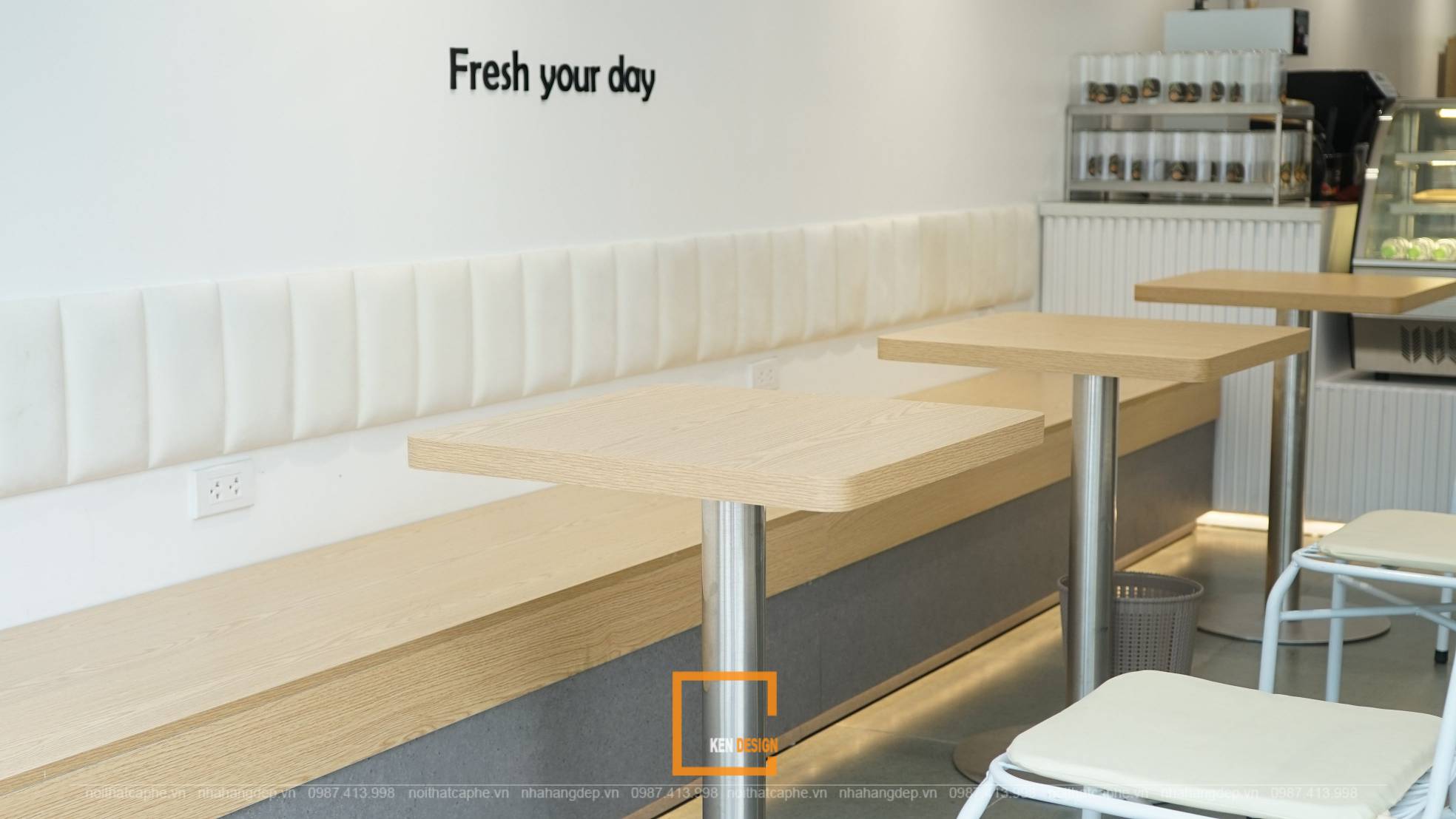
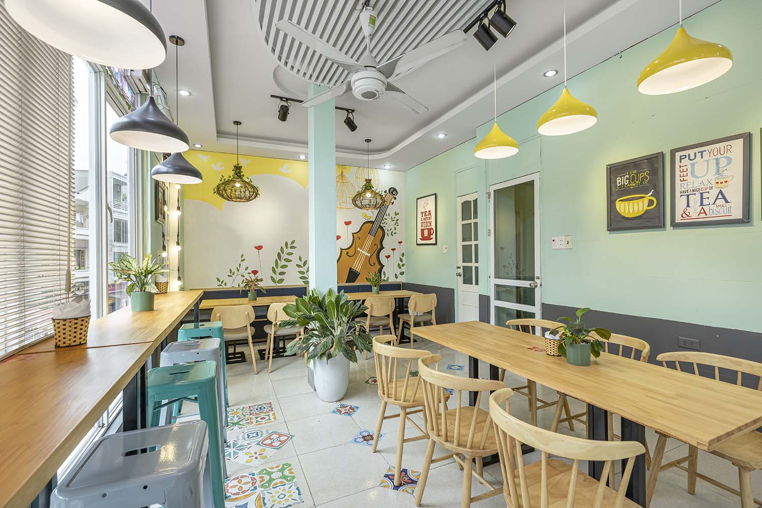
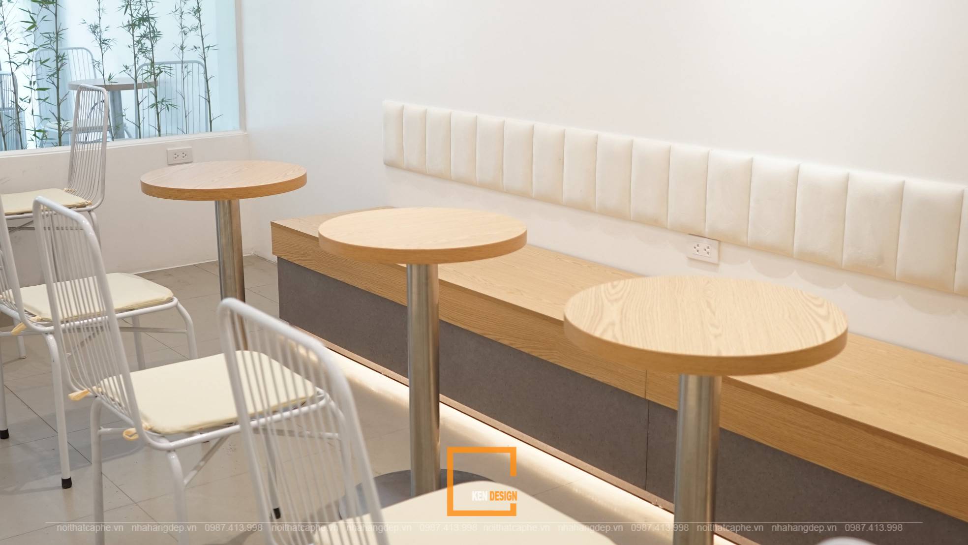
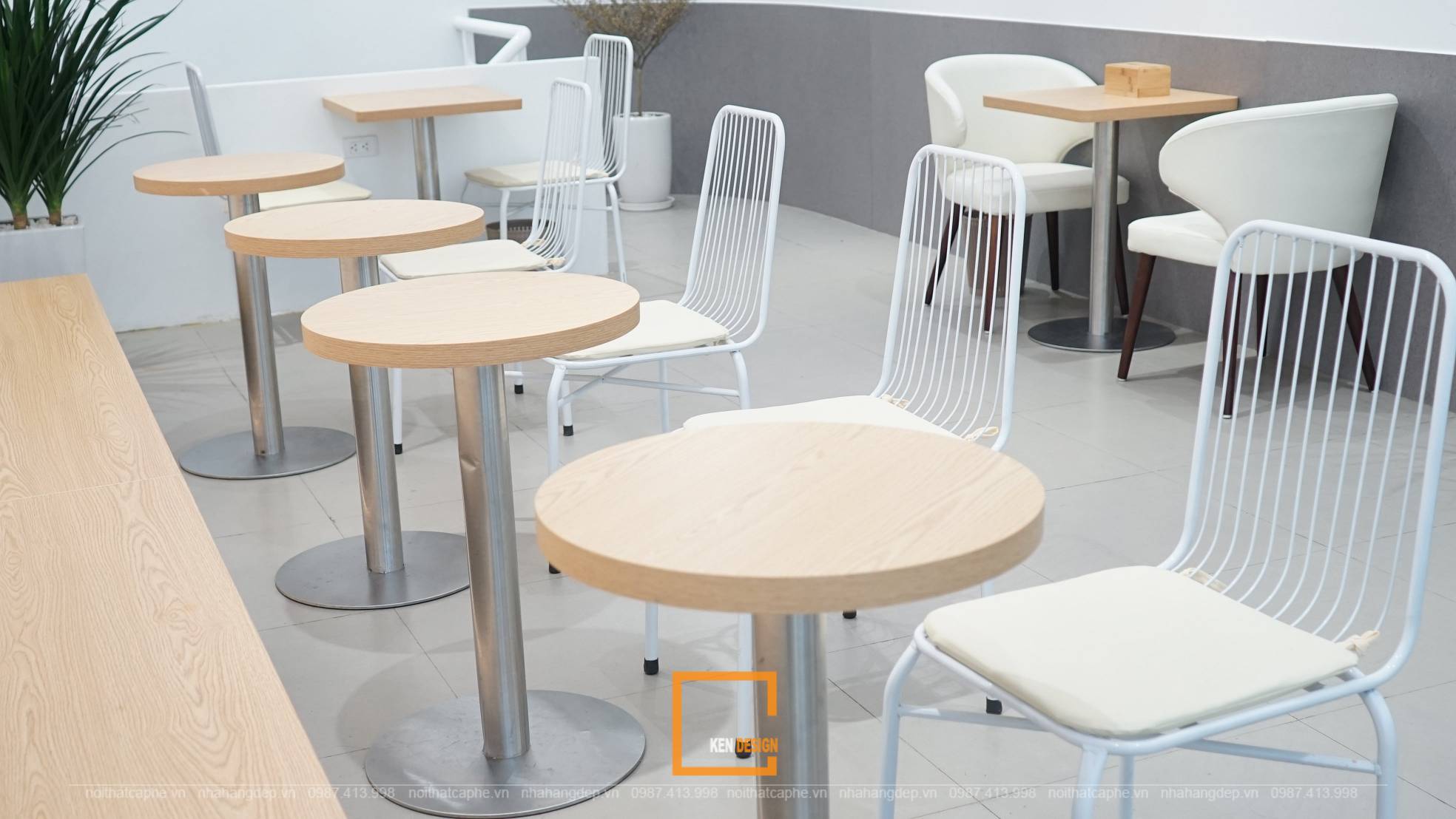
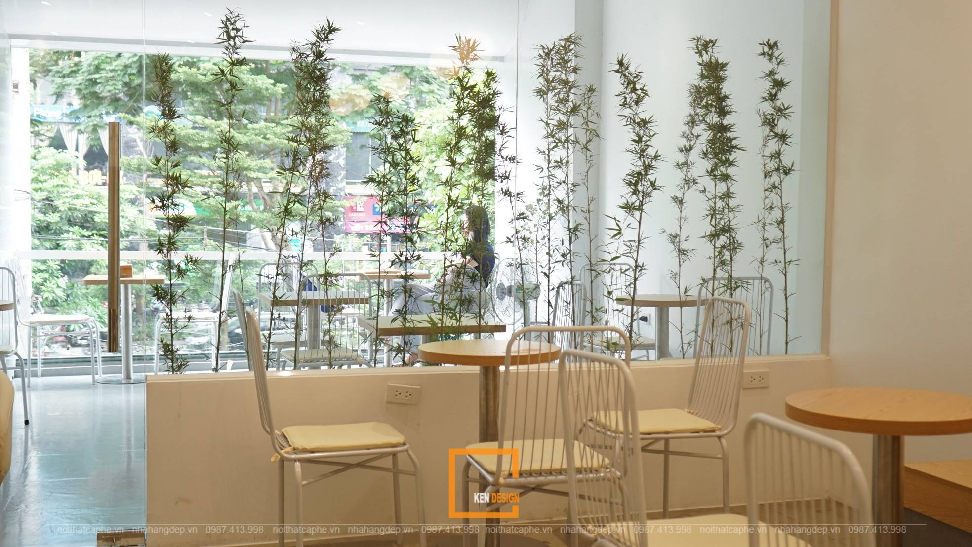
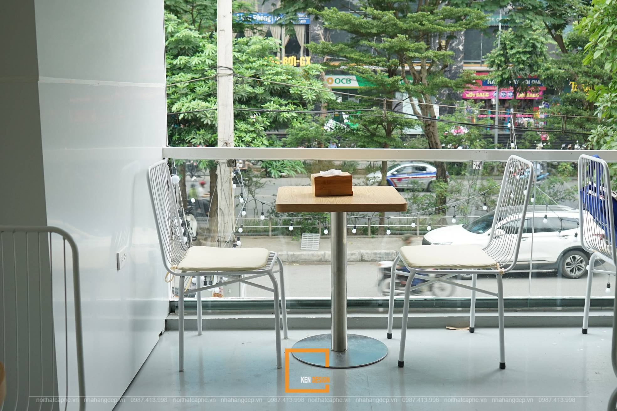
The interior of the second floor impresses with natural and unique decorative elements. The cafe incorporates small potted plants, placed in glass partitions that separate the interior space from the canopy area. These plants do not occupy much space but bring freshness to the area without feeling confined. The open space is the focus of Rosier's minimalist cafe style. Besides the indoor area, the canopy area on the second floor is also dedicated to customers who enjoy relaxing corners and want to have a panoramic view of the street. The layered ceiling is adorned with charming globe-shaped lights, adding an extra touch of interest for customers.
Ken Design - Your Interior Design and Construction Solution
Rosier is one of the projects that has received praise from the owner and numerous visiting customers. It will undoubtedly become a strongly impressive minimalist-style cafe, serving as an ideal place for gathering, relaxing, working, and capturing stunning moments. If you're also looking to own a cafe with a similar ambiance, don't hesitate to contact us for early consultations. Ken Design is honored to accompany you in every project
