Nestled in the bustling Hồ Tùng Mậu Street (Hanoi), the Korean BBQ CHICKEN Restaurant Design – Hồ Tùng Mậu stands out with a brand-new look that fully embodies the vibrant spirit of modern Seoul. Designed by a team of professional architects, the project aims to create a youthful, energetic atmosphere infused with authentic Korean character — a place where diners can not only enjoy the famous crispy fried chicken but also experience the lively “Seoul vibe” right in the heart of Hanoi.
1. Current Layout Overview
Before renovation, the restaurant’s layout was modest in size, with l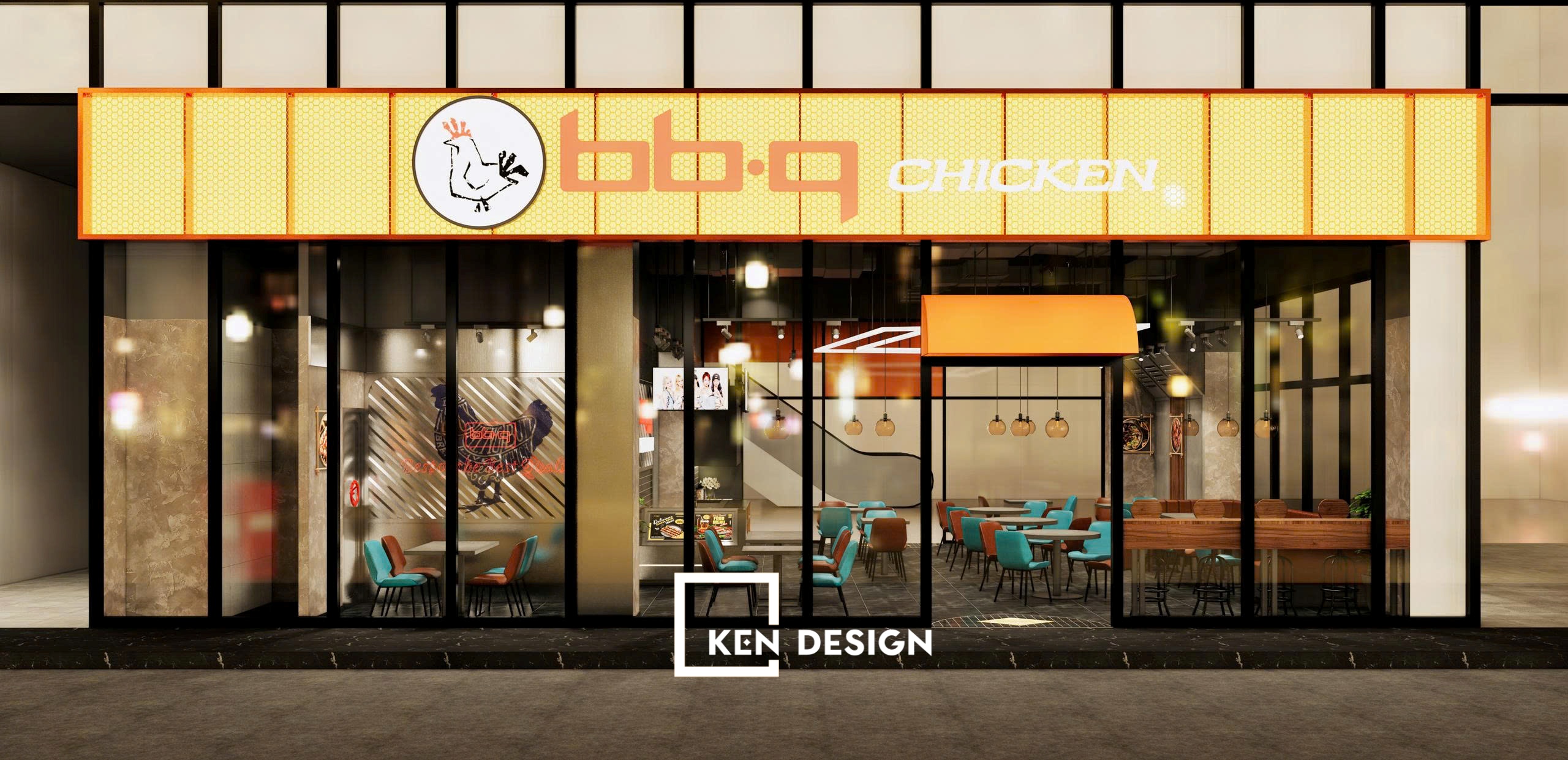 imited lighting, unoptimized zoning, and a lack of brand identity. These factors resulted in a somewhat restricted customer experience.
To address this, the design team completely restructured the space, transforming it with a modern Urban Street aesthetic and a vibrant Korean flair.
2. Urban Street Design Concept
Inspired by Seoul’s street culture, the restaurant embraces an Urban Street style — dynamic, bold, and full of energy.
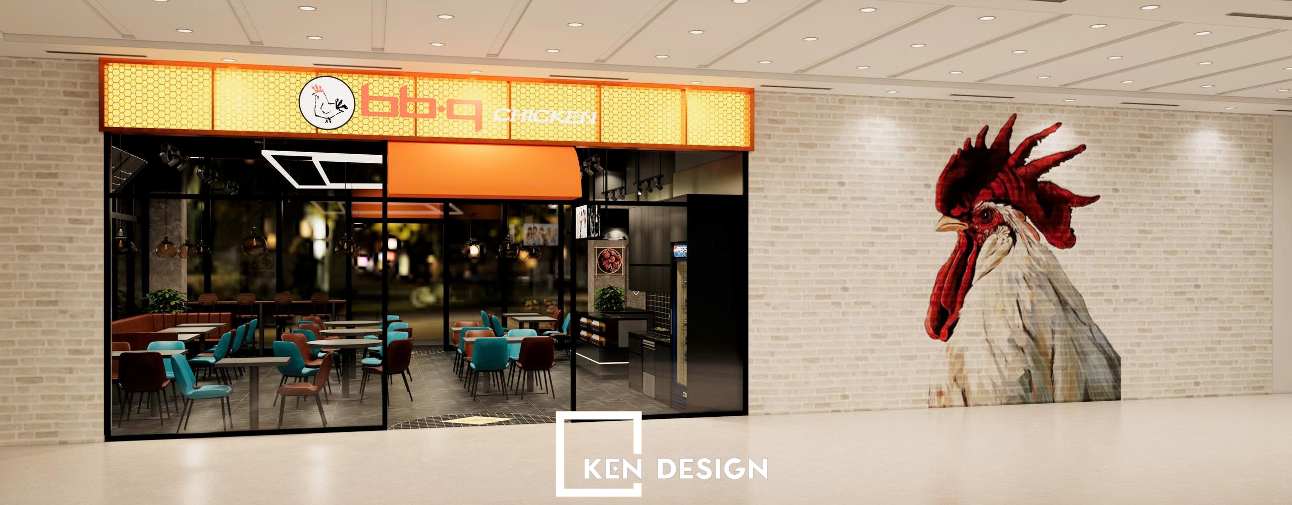
Decor elements such as exposed concrete brick walls, black electrostatic metal frames, glowing neon lights, and graffiti-style signs were cleverly integrated to evoke a contemporary urban atmosphere.
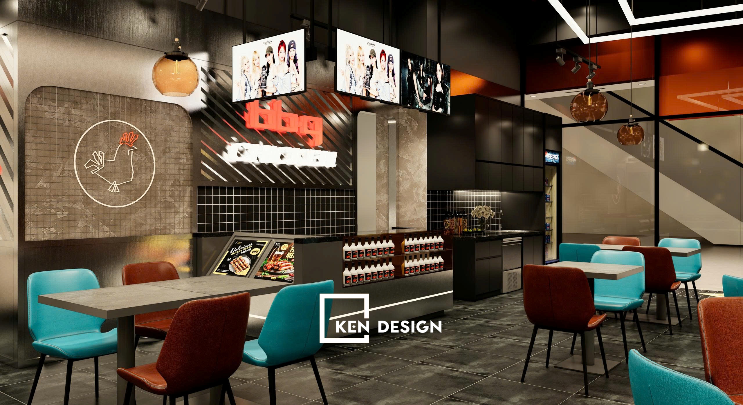 The result is a seamless blend of tradition and modernity — distinctly Korean yet refreshingly youthful — perfectly aligned with the BBQ CHICKEN brand’s identity.
3. Interior Space – Bold and Inviting
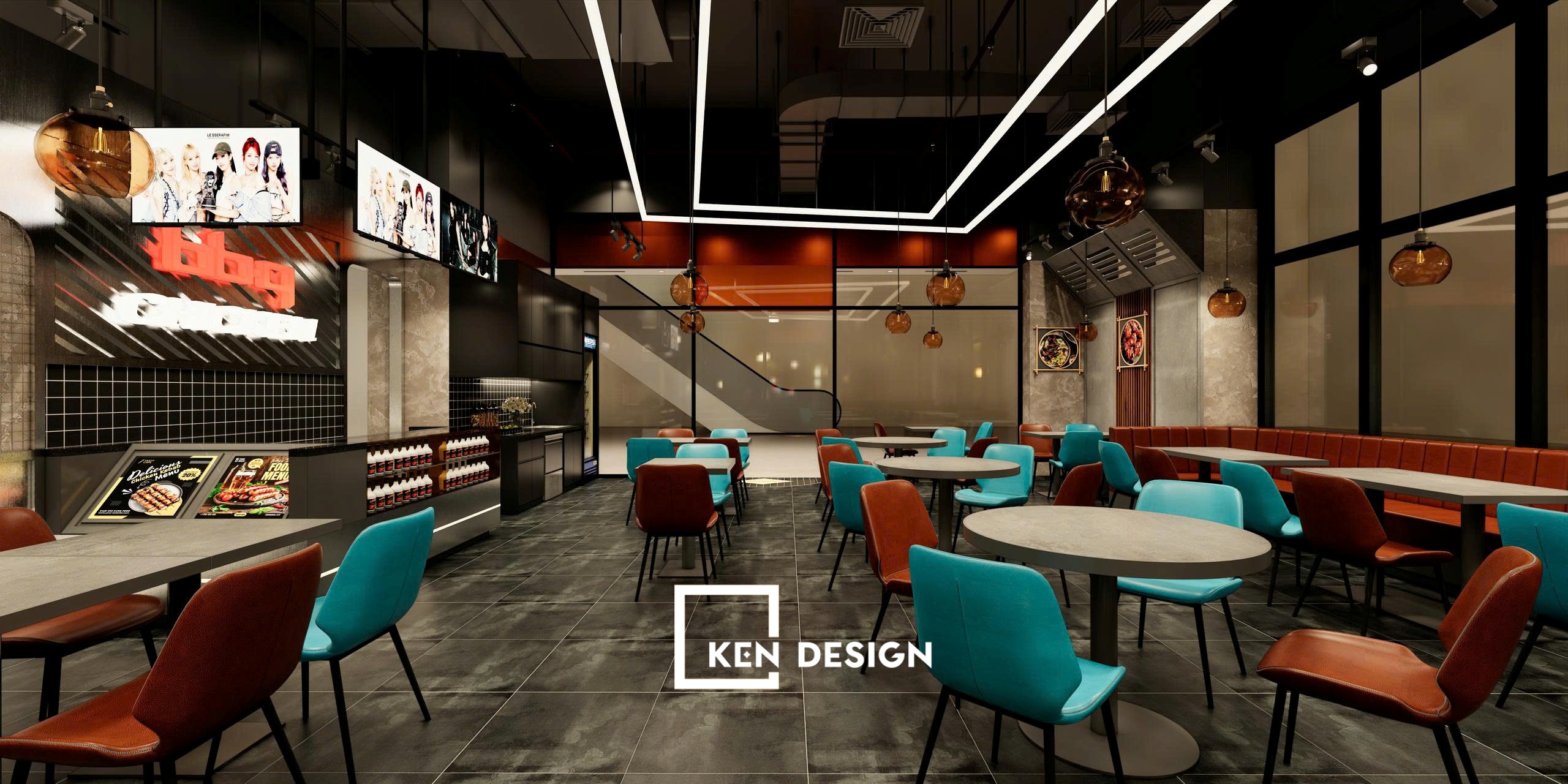
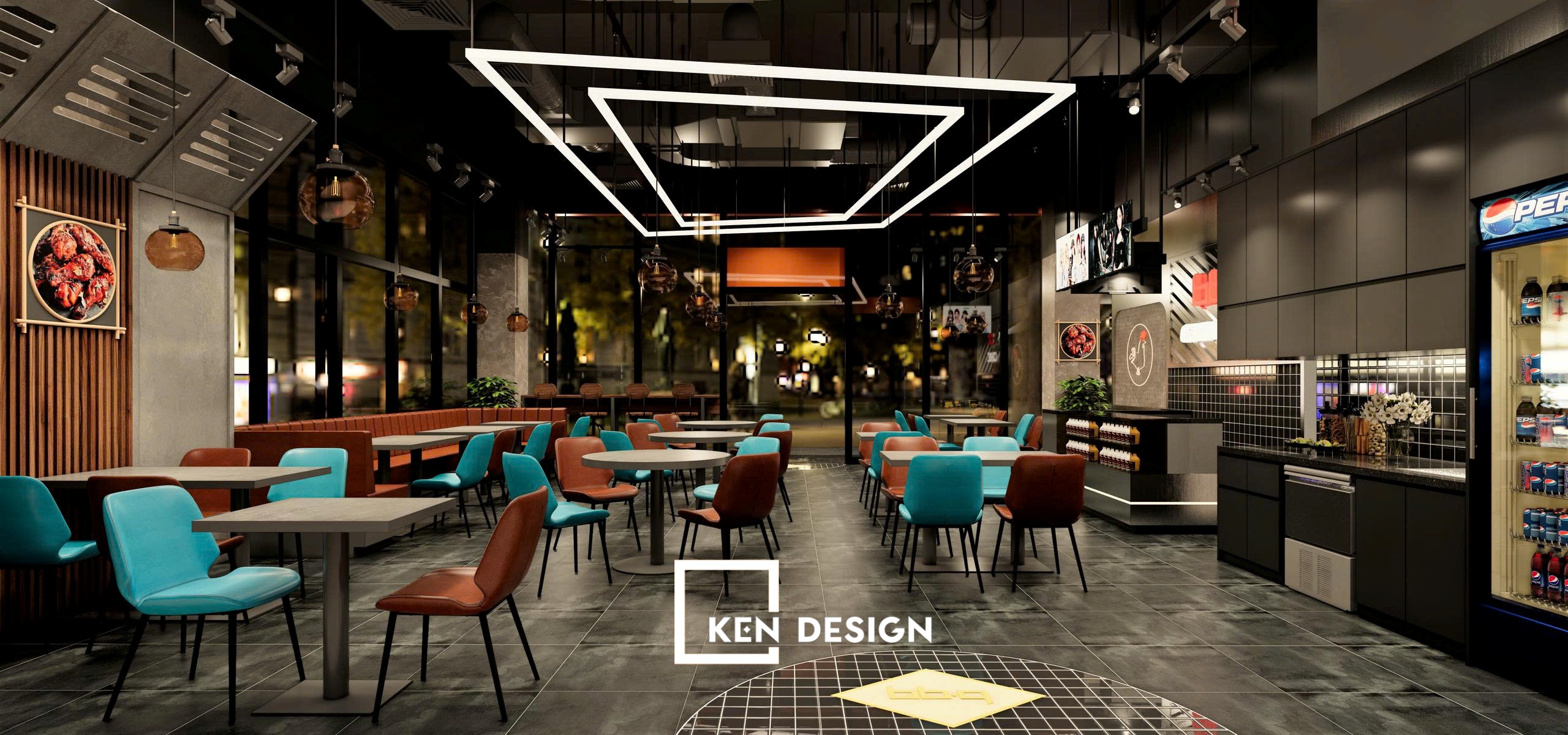
The interior design of the Korean BBQ CHICKEN – Hồ Tùng Mậu restaurant captivates with its youthful and open layout while ensuring functional efficiency.
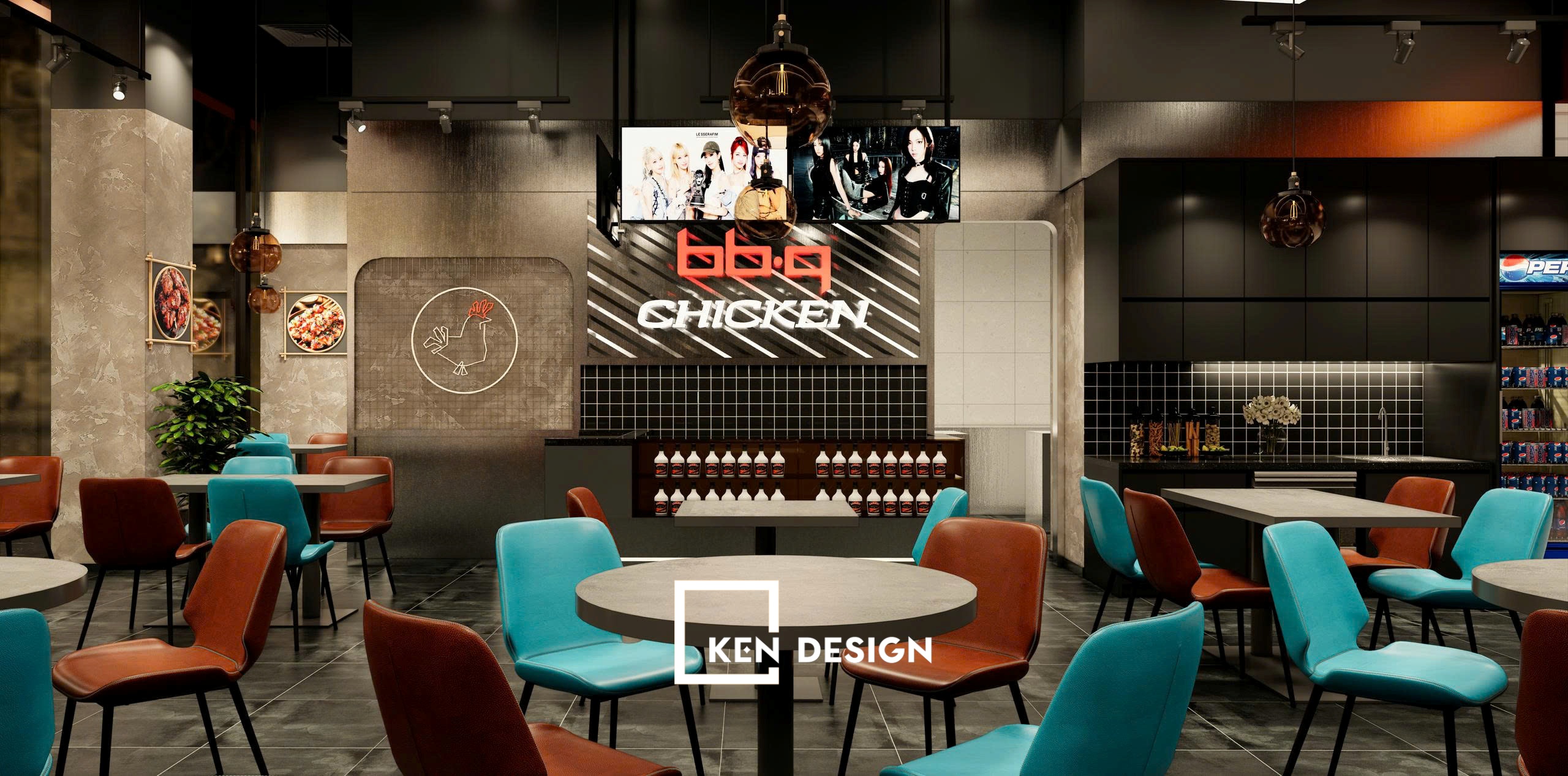 The main color palette — orange, black, and yellow — reflects the brand’s identity, balanced with mint green and camel brown tones for visual harmony. This combination makes the space both lively and comfortable.Primary materials include engineered wood, faux-concrete tiles, and matte black metal — ensuring durability and easy maintenance.
 Rounded furniture corners, minimalist lines, and distinctive rooster logo details strengthen brand recognition from the very first glance.
4. Flexible and Smart Spatial Layout
The space is divided into multiple zones with smart, cohesive organization:
-
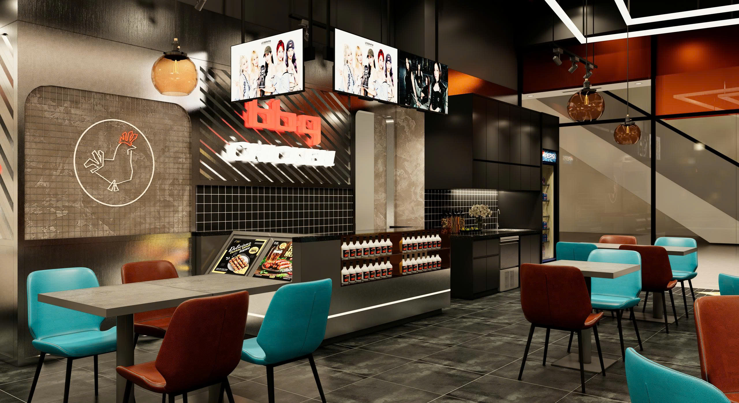
Order & Service Counter: Compactly designed with dark brick backgrounds and focused warm lighting for a professional look.
-
Dining Area: Features a mix of round, square, and long tables suitable for groups of 2–6 guests, with spacious aisles for smooth movement.
-
Decor & Check-in Corner: A mural of a giant rooster and glowing Korean neon letters form an Instagram-worthy highlight, attracting visitors for photos.
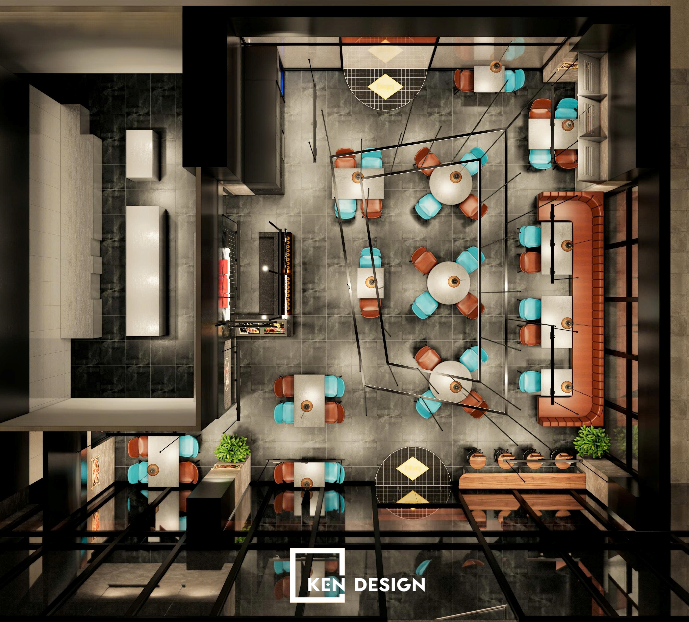
Every section is interconnected, maximizing usable space while maintaining visual appeal and customer comfort.
5. Lighting Design – The Soul of the Space
5.1 Pendant and Decorative Lighting
Soft warm-yellow pendant lights fill the dining area, creating an intimate, cozy ambiance that enhances the food presentation.
 The balance between warm and cool white lighting ensures an authentic “Korean dining vibe.”
5.2 Neon Lights and Illuminated Signs
The glowing BBQ CHICKEN neon signs in orange-red tones highlight the brand’s identity and inject a vibrant street-style energy.
 These illuminated accents also make the restaurant stand out at night, drawing attention from passersby.
5.3 Natural and Artificial Lighting Integration
Large glass facades allow abundant natural light during the day, making the space airy and inviting.
At night, the artificial lighting system takes over, transforming the restaurant into a bright, dynamic scene full of life.
6. Color Palette – Brand Identity at Its Core
Color plays a key role in the Korean BBQ CHICKEN – Hồ Tùng Mậu design. The signature orange–yellow–black scheme not only represents the brand but also evokes warmth, energy, and friendliness.
 Touches of mint green and camel brown balance the vibrancy, adding a refined, modern edge.This color harmony aligns with 2025 restaurant design trends — youthful, dynamic, and emotionally engaging.
7. Project Value and Impact
Upon completion, the Korean BBQ CHICKEN – Hồ Tùng Mậu quickly became a favorite destination among young people in the Cầu Giấy district. Its radiant, trendy Korean-inspired atmosphere helped the brand:
-
Strengthen local brand recognition in a competitive market.
-
Stand out among numerous fried chicken restaurants.
-
Deliver a cohesive sensory and emotional experience, leaving a lasting impression on first-time visitors.
This project is a testament to the power of professional restaurant design — where every detail tells a story.
Conclusion
The Korean BBQ CHICKEN Restaurant Design – Hồ Tùng Mậu: A Youthful Space Bursting with Korean Flavor perfectly merges culinary excellence with spatial experience. With its dynamic Urban Street style, vibrant color palette, and smart layout, the project has become a magnetic spot for Korean culture enthusiasts in Hanoi.
If you’re planning to design a Korean BBQ CHICKEN restaurant that stands out with a strong brand identity, contact KenDesign today at 0987 413 998 or visit our fanpage for personalized consultation and the most impressive 2025 café garden design concepts.