The fusion of the rustic charm of the Mekong Delta with modern elements makes the design of the Mekong Seafood Restaurant in Trung Hoa stand out like never before. This has led to the rise in popularity of Mekong Delta-style restaurants in the area. Let's explore the design of the Hai Mien Tay Restaurant at Trung Hoa with KenDesign through this article.
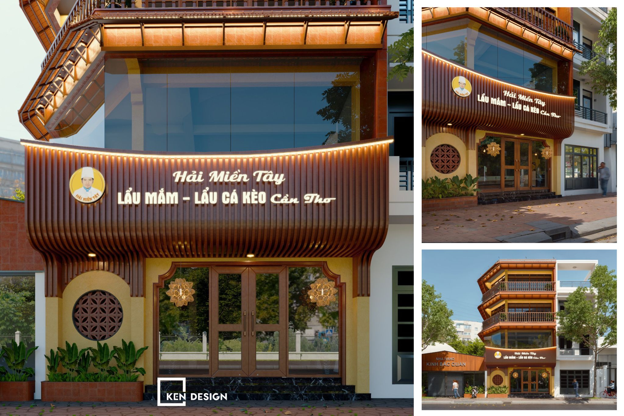
Project on the Design of the Hai Mien Tay Restaurant - Trung Hoa
The Hai Mien Tay brand has been present in the market for a while, leaving an impression on customers with authentic dishes from the Hai Mien Tay. The delightful taste of the dishes, combined with an elegant dining space, attracts customers regularly.
Following the success of the previous establishment, KenDesign is delighted to receive the trust and collaboration of the investors. With the project to design the Hai Mien Tay Restaurant, the investor aims to recreate a Southern Mekong Delta culinary space amid the bustling city, allowing customers to truly relax and enjoy authentic local dishes with unique flavors. Hai Mien Tay specializes in serving dishes such as fermented fish hotpot and snakehead fish hotpot. Therefore, the restaurant's ambiance needs to evoke the genuine feeling of dining at an authentic Hai Mien Tay eatery.
Inspiration from the Mien Tay Delta Space
Starting as a Mekong Delta restaurant, KenDesign aims to bring the image of the Southern Mekong Delta closer to people. Since the restaurant serves dishes like fermented fish hotpot and snakehead fish hotpot, KenDesign opts for a classic design style, using a rural language to match the spirit of the cuisine.
The restaurant draws design inspiration from the investor's desire to create a gently rustic countryside-style restaurant. The space, inspired by the river and water region, provides customers with a sense of familiarity and closeness when entering the restaurant to enjoy traditional and rustic dishes.
Impressive Exterior Space
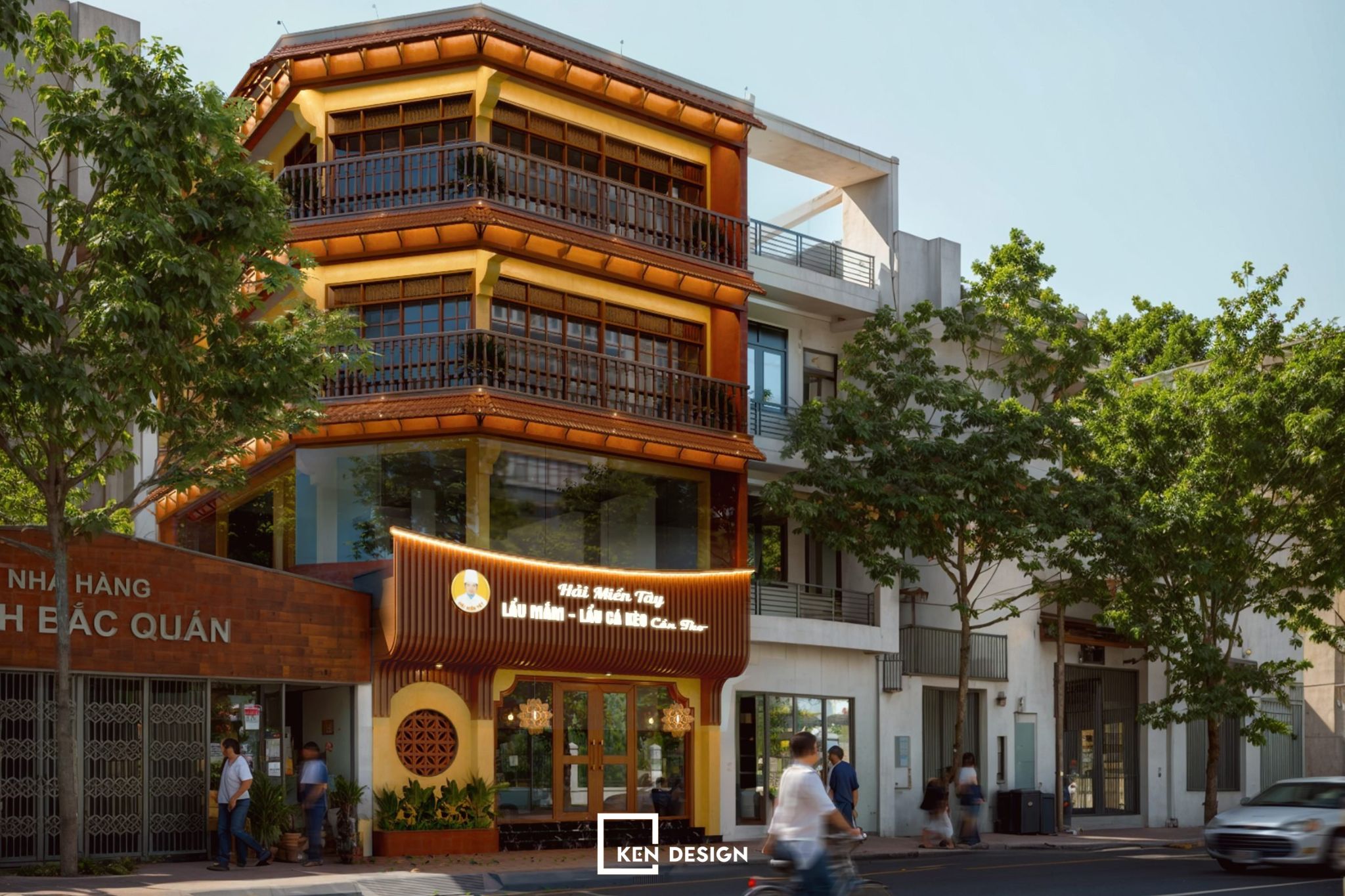
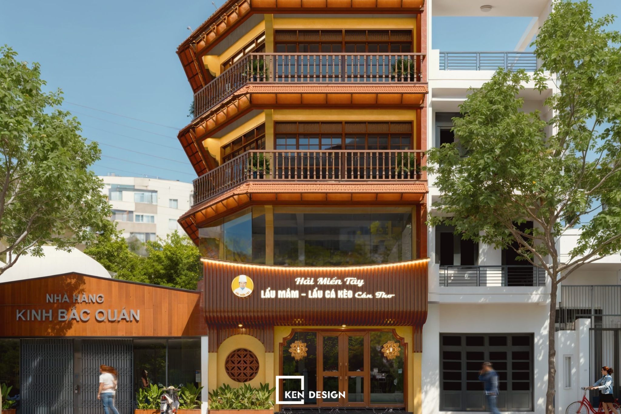
The front of the restaurant is designed to be inviting and prominent, resembling an ancient house. The concept involves a tiled fence design surrounding the restaurant. Guests will notice the traditionally designed entrance gate. The use of glass doors as entrances enhances the spacious feeling, combined with a uniquely designed canopy to attract customers.
Interior Space Division
The Hai Mien Tay Restaurant design consists of three floors: the first floor is a communal dining area both indoors and outdoors, while the second and third floors are VIP areas. Essentially, these two spaces do not differ much in terms of color, but the arrangement of functional tables and chairs, as well as the decoration, differs.
This meets the current needs of customers. For daily dining needs, customers can be comfortably served outdoors. The restaurant is also a place to host small intimate gatherings, and private rooms with absolute privacy are the perfect choice.
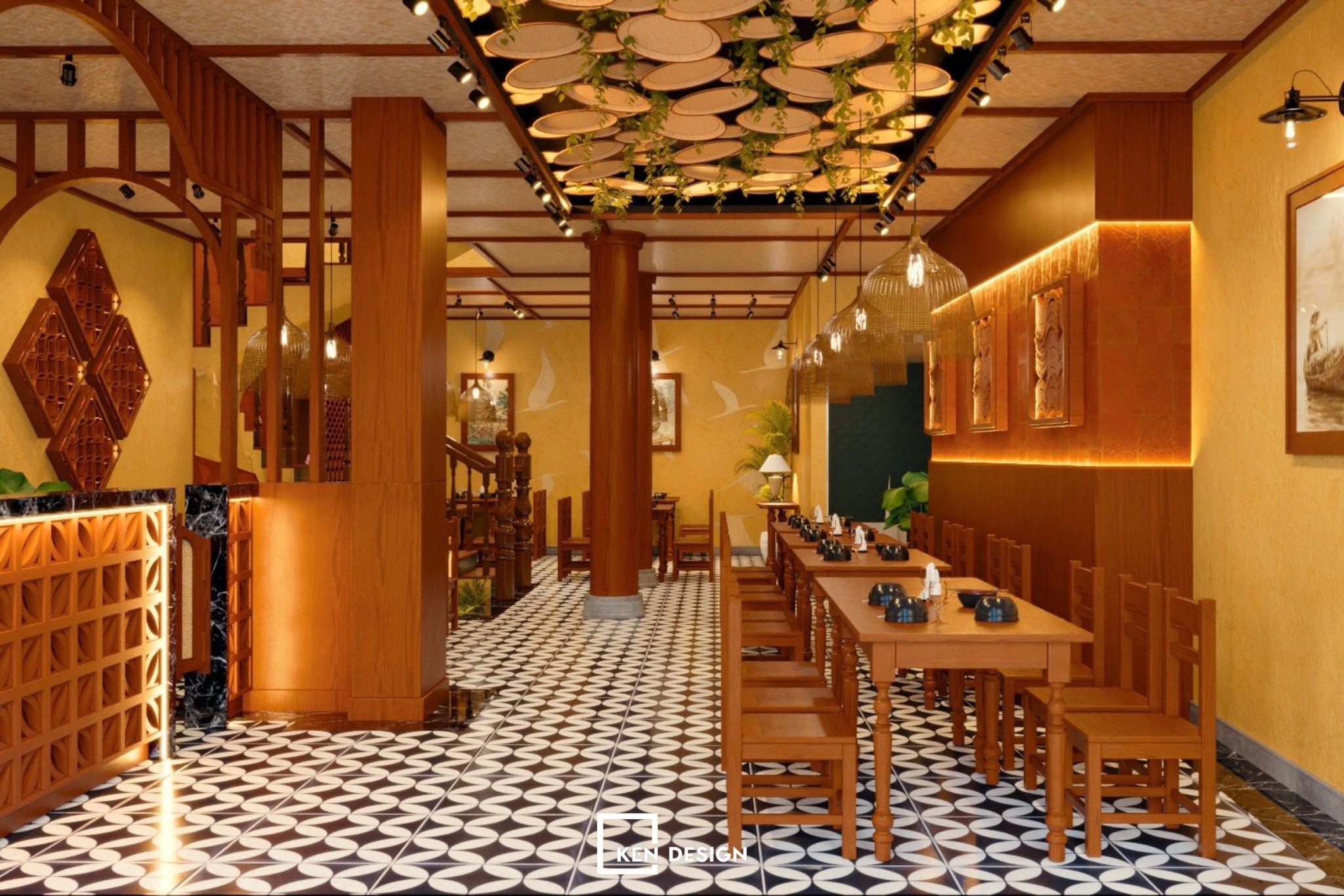
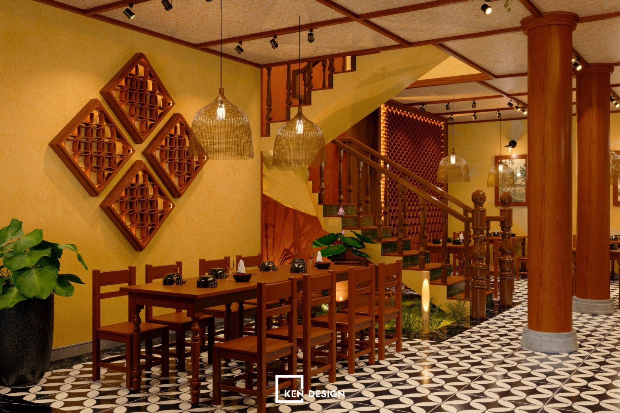
Inside the restaurant is beautifully designed, with rough brick walls enhancing the peaceful and familiar atmosphere. Interwoven within the space are unique areas with eye-catching decor. If you pay attention, you can spot familiar rural images like bamboo, thatch, and woven materials designed scientifically. The well-arranged space allows customers to move easily and is also attractively designed to enhance the aesthetic appeal of the restaurant.
First-floor Interior Space
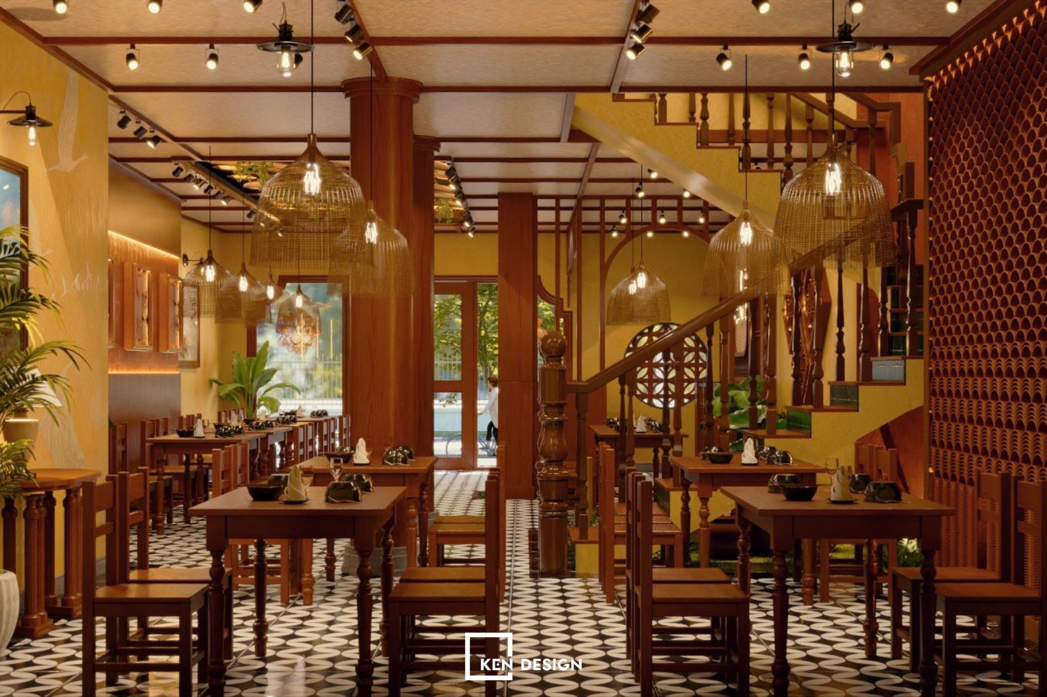
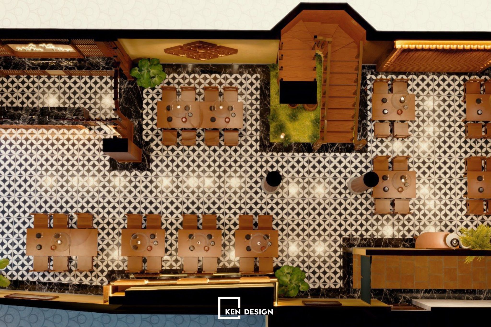
In the communal area, the design of the Hai Mien Tay Restaurant in Trung Hoa features scientifically arranged tables and chairs, ensuring standard spacing between tables. Therefore, customers dining here still feel the necessary privacy.
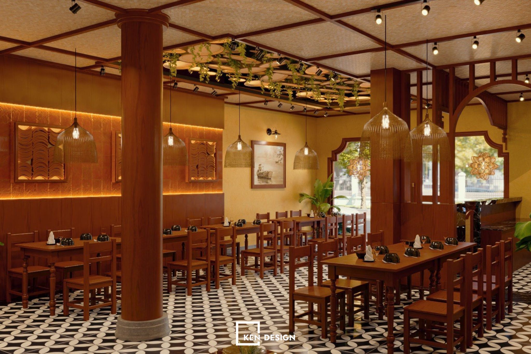
The Hai Mien Tay Restaurant design is not just a place for customers to enjoy delicious dishes; it is also a place where people can comfortably admire impressive and unique details. Every space in the restaurant has standout features. A prime example is the cashier counter, which, though seemingly simple, serves the overall function of the restaurant.
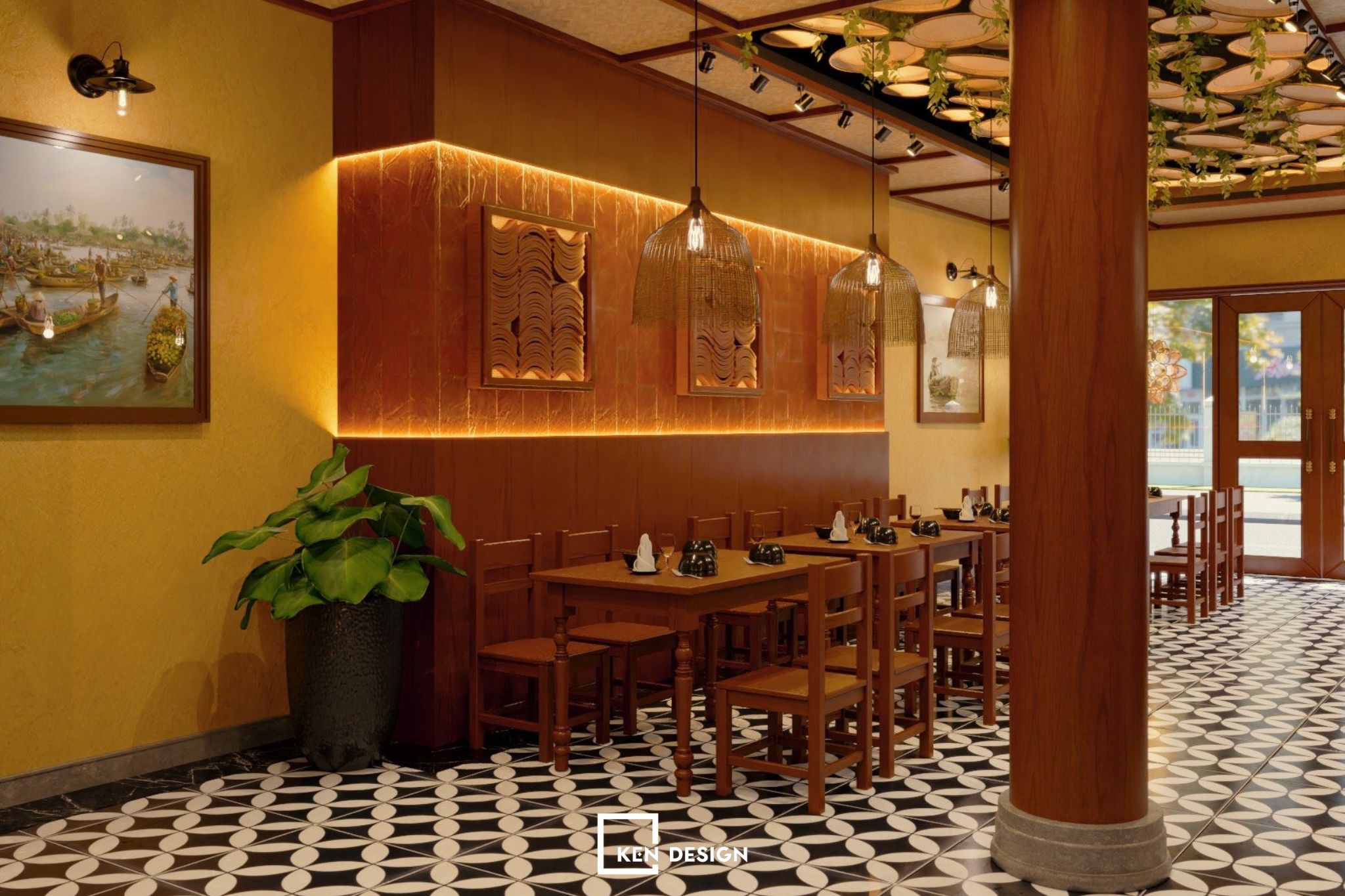
The most noticeable highlight that people see is none other than the traditional wind-blown flower tiles used in the design. The space is both modern and folk, fulfilling the desires of the investor. KenDesign also adds a few other details such as wall tiles and the use of fishing baskets as bold decorative elements.
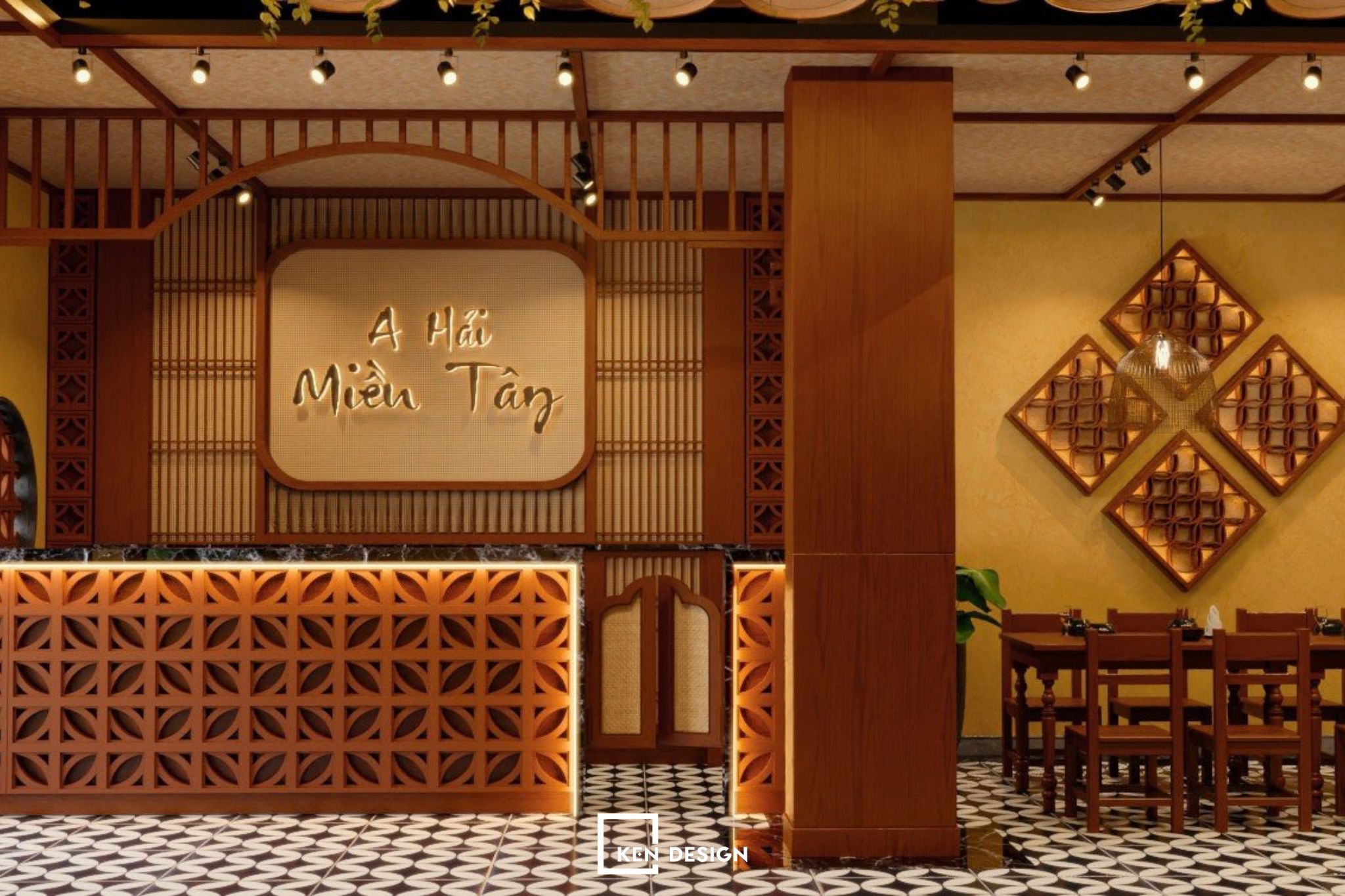
KenDesign's architects paid attention to the exchange time between the cashier area and the kitchen. Therefore, to minimize the time, the cashier counter is placed near the kitchen for more convenient operations.
Second and Third Floor Space - VIP Rooms
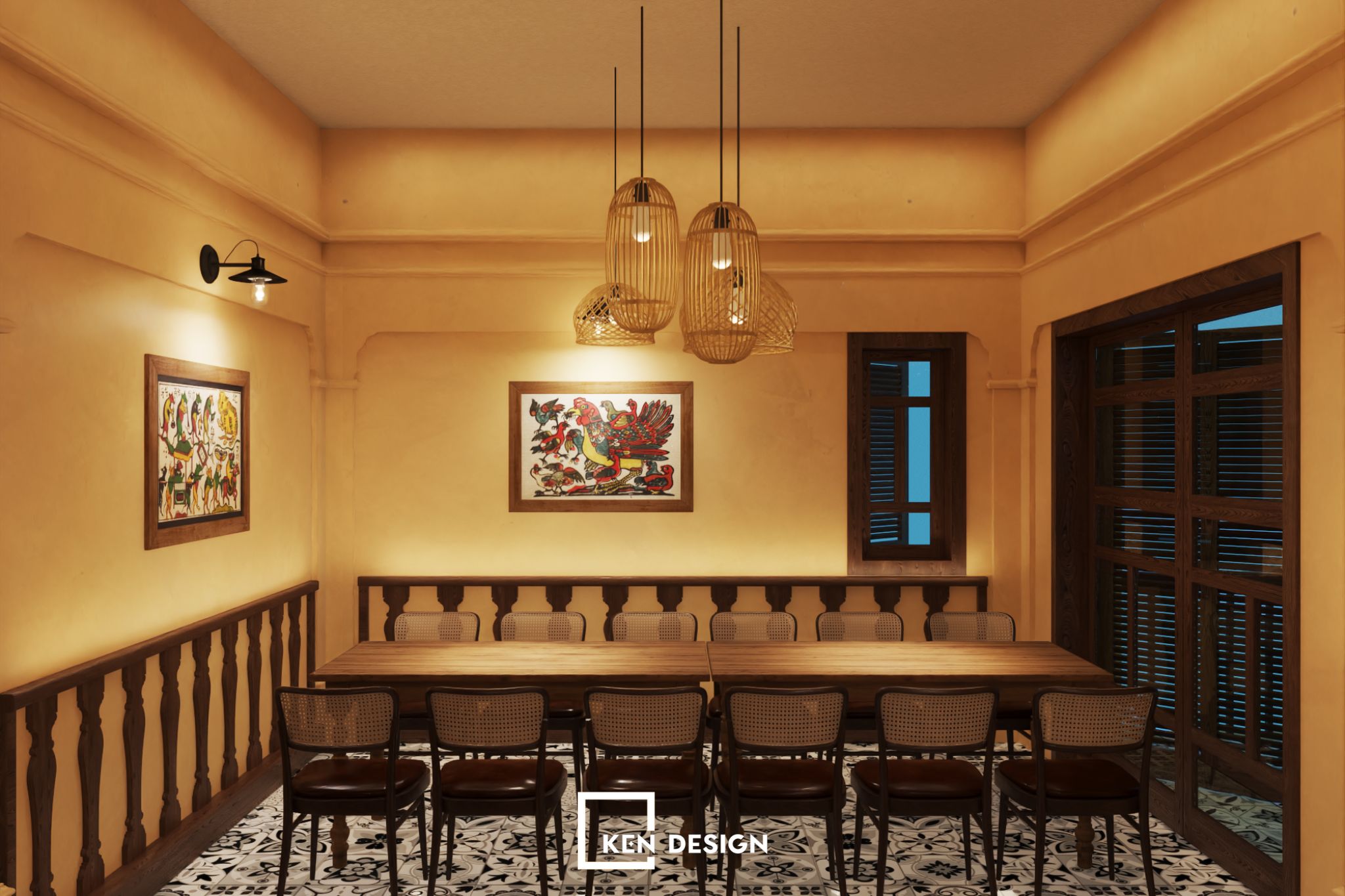
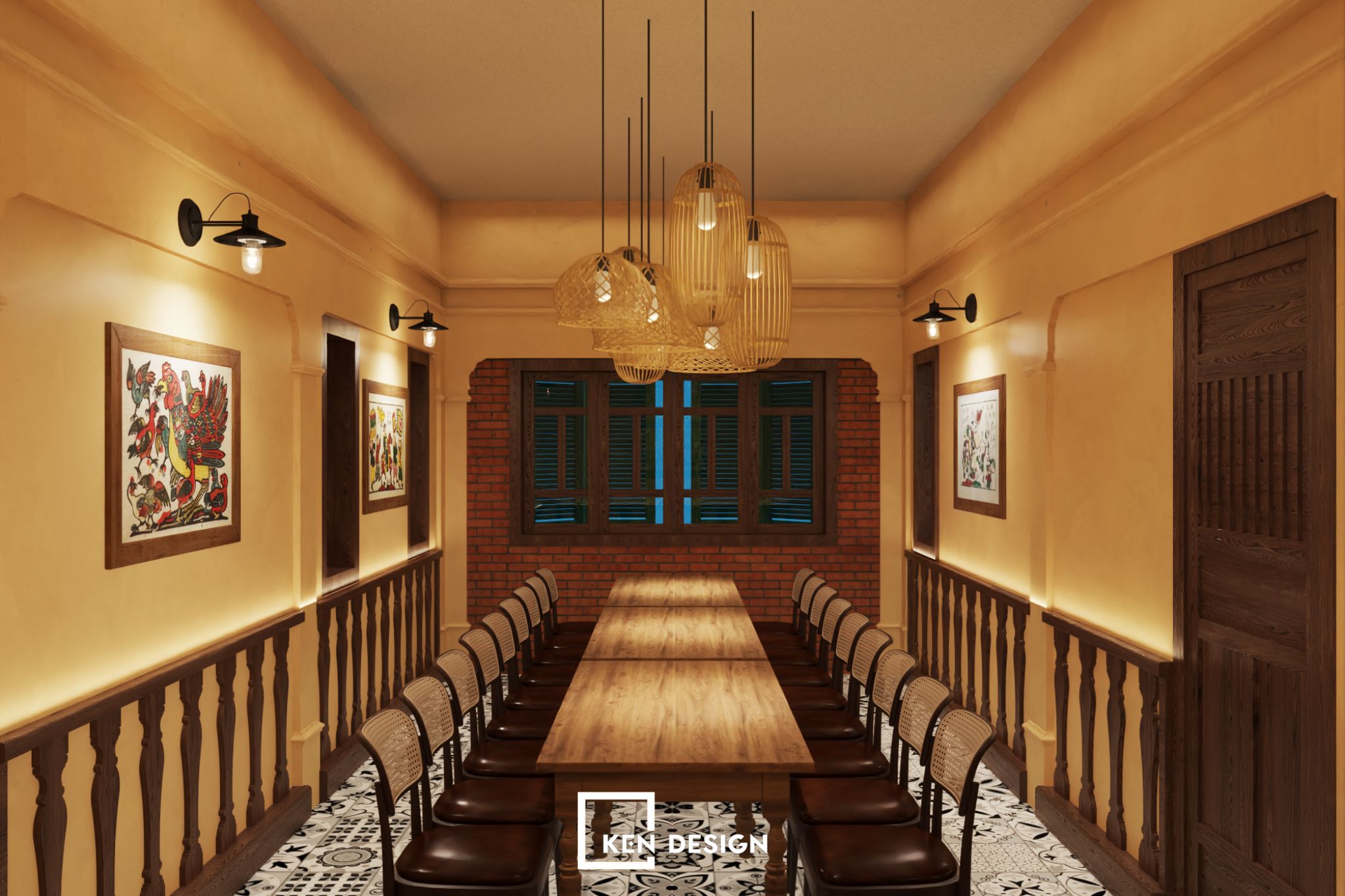
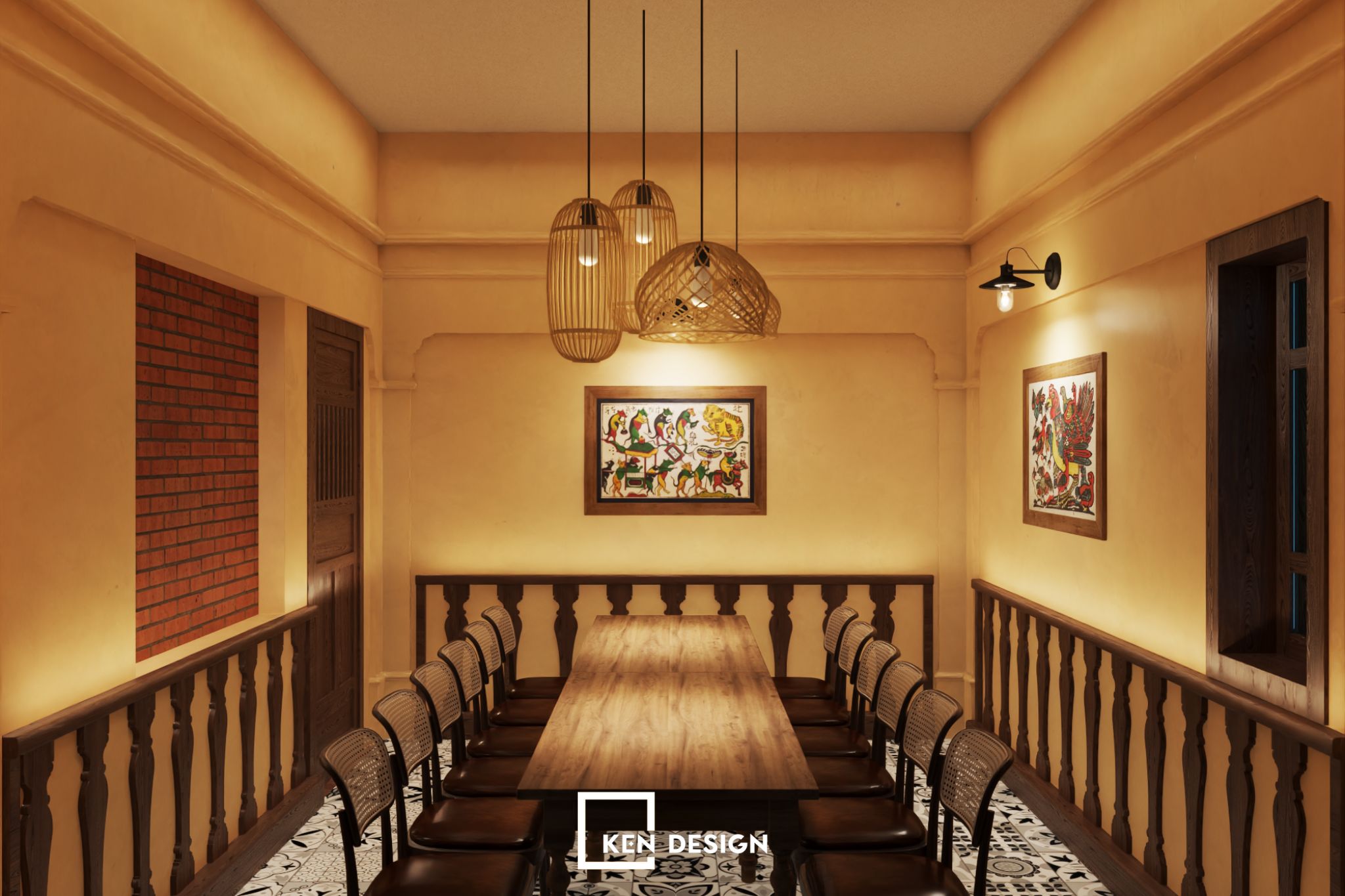
Moving on to the VIP area for pre-booked customers, this area is private and quiet, making it suitable for important business meetings. In the room, the dominant color is still yellow but is adorned with exceptional paintings on the wall. Additionally, the decorative lighting system is designed like baskets and fishing nets, creating a captivating atmosphere.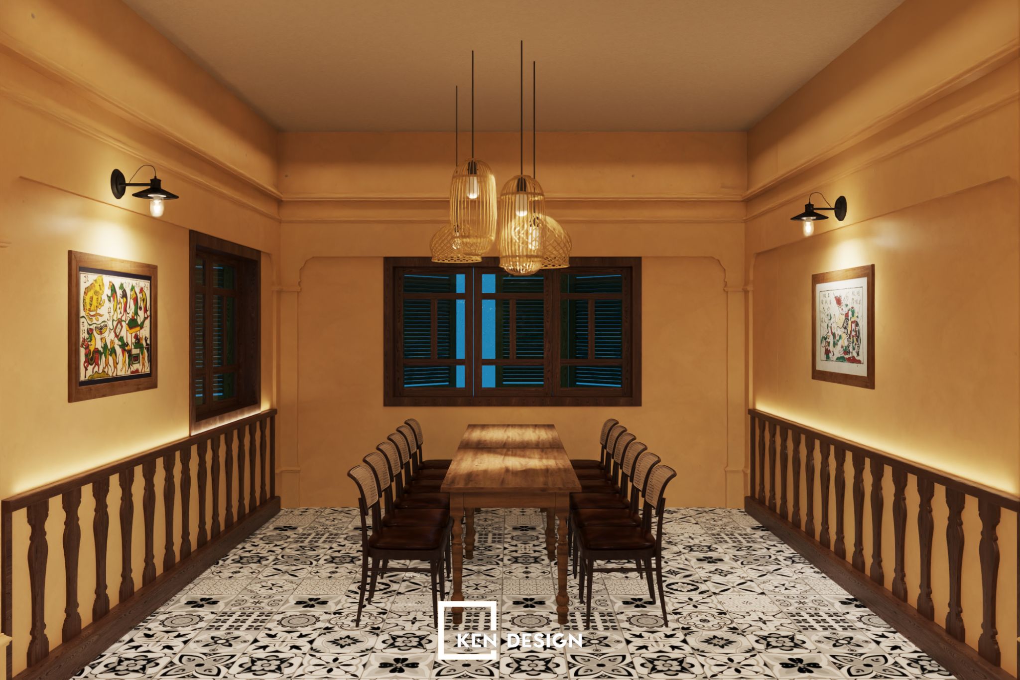
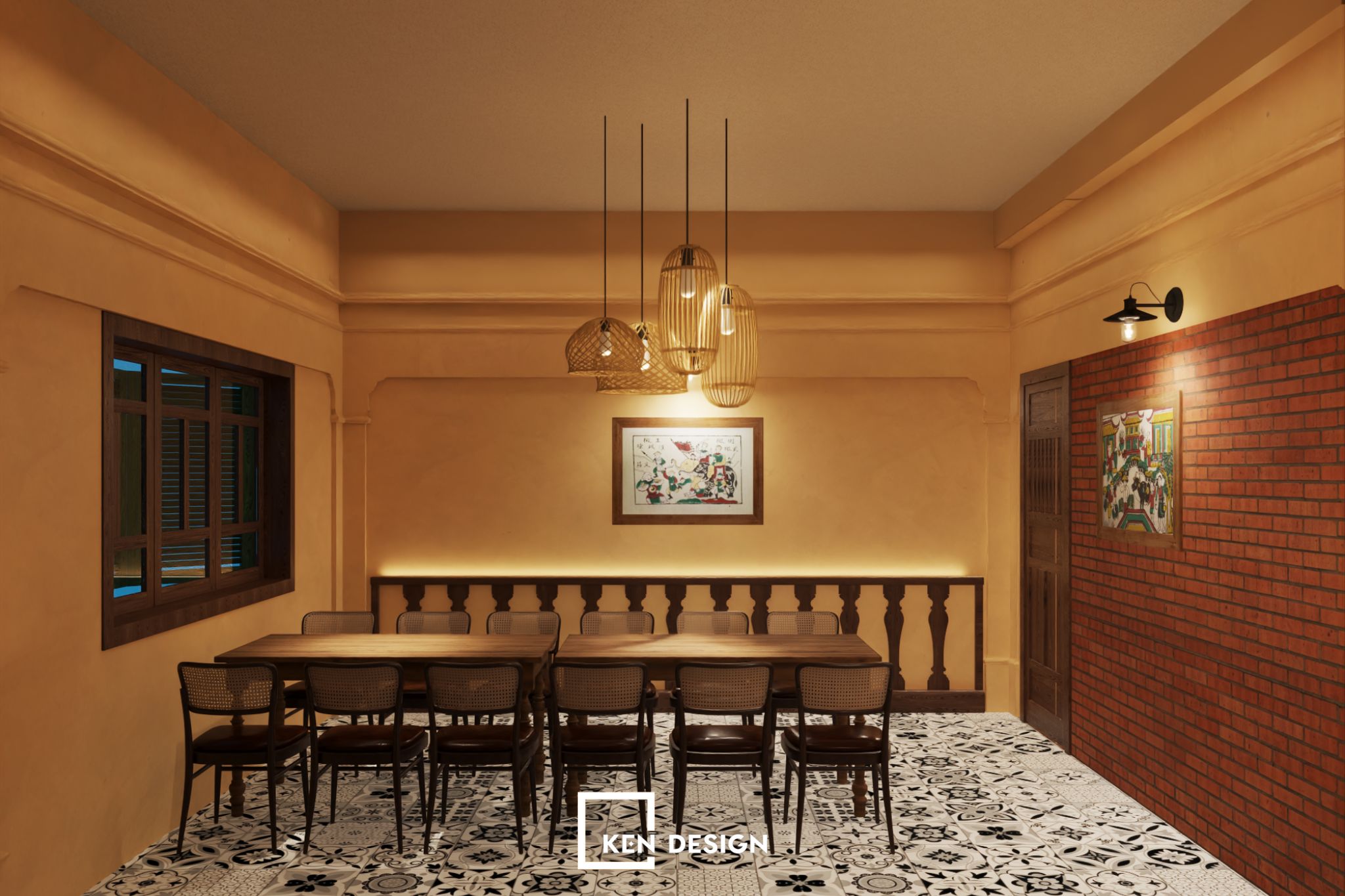
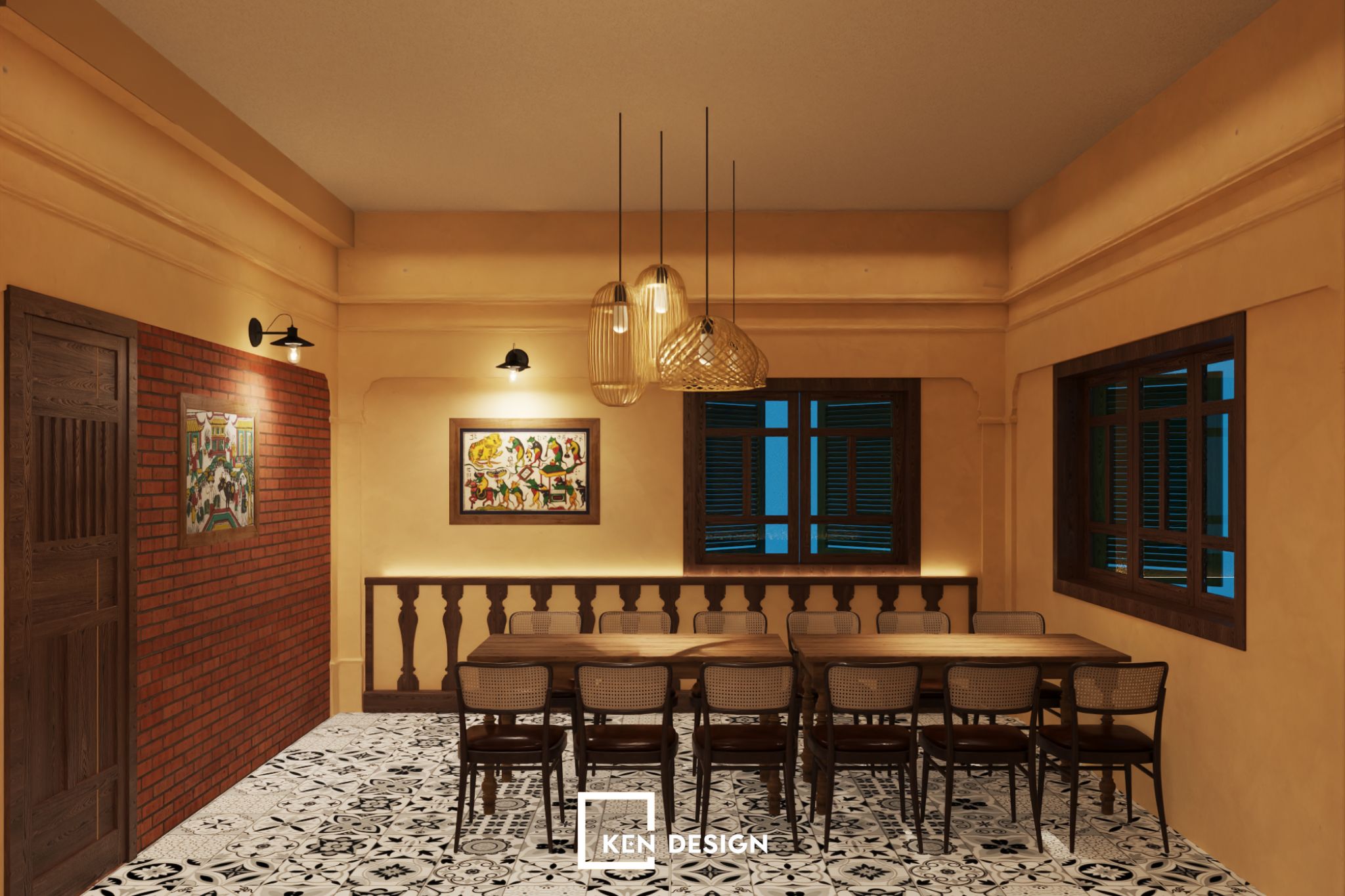
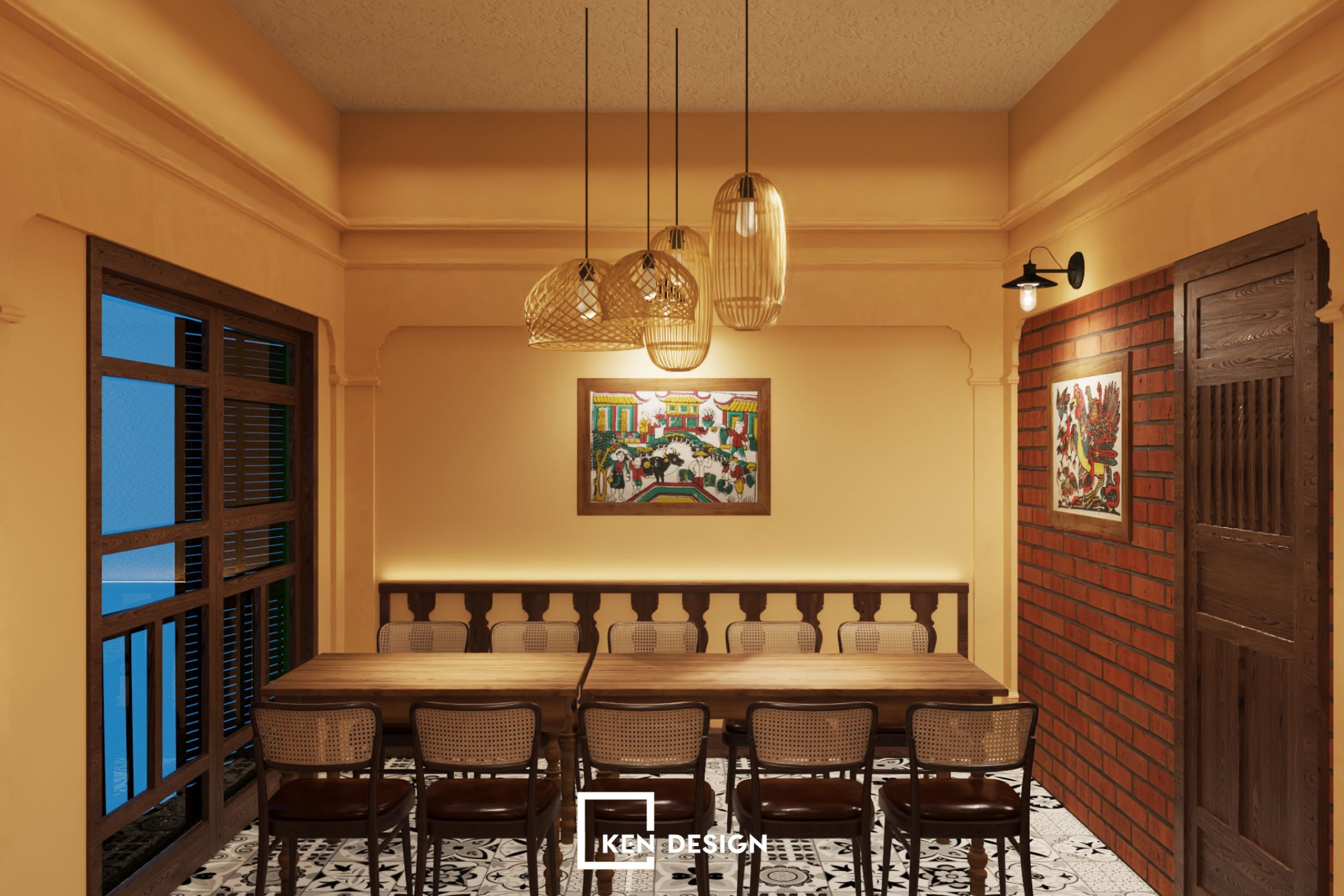
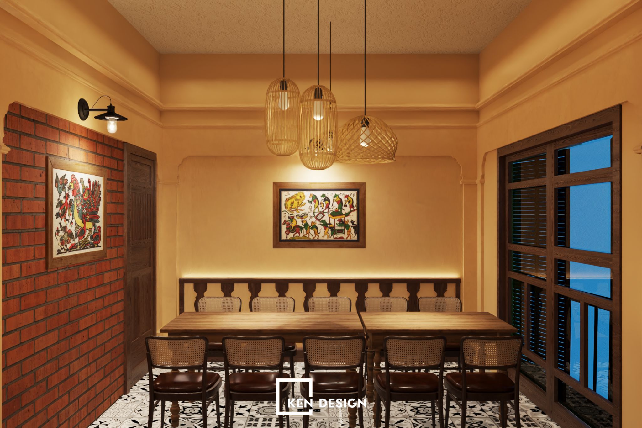
The indoor area is designed with private rooms that recreate the beauty of classical times but remain very elegant. Corresponding to each season is a characteristic image combined with corresponding furniture and decorations, creating realistic and beautiful paintings for the restaurant. This also means that you can experience a different feeling each time you enter a room, providing an enjoyable experience for customers.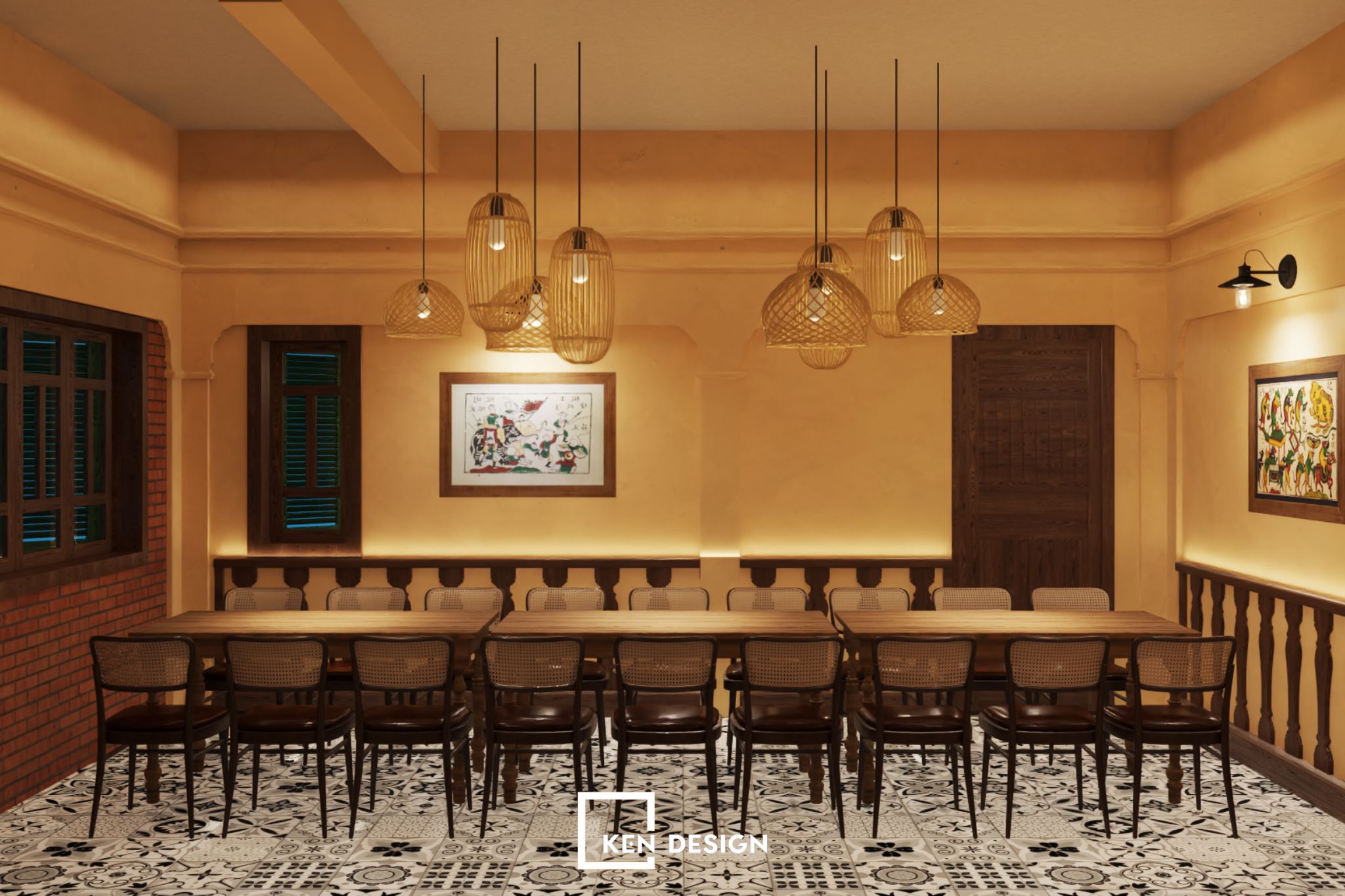
Tasteful Rustic Interior
To harmonize with the interior design of the Hai Mien Tay Restaurant, our architects chose industrial wood materials for the restaurant's interior. Thanks to this, the overall restaurant becomes more luxurious, impressive, and durable. If you consider the interior of the Mekong Seafood Restaurant as a work of art, it is not difficult to understand because, when you look at it, you are completely surprised and attracted.
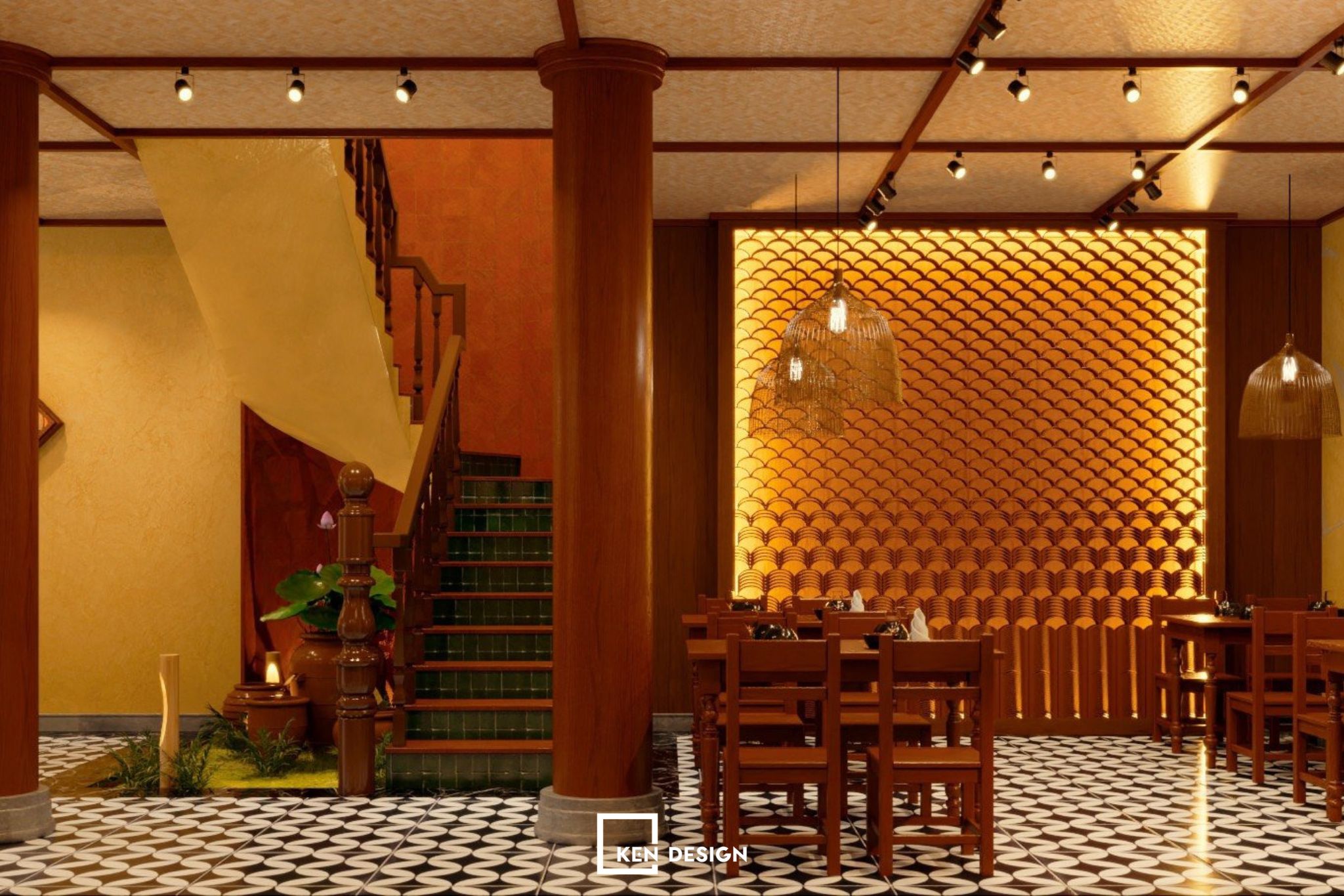
Ken Design's architects chose a style that combines classic and modern to decorate the restaurant's space and interior. You can feel that through the brick wall architecture along with the large wooden ceiling.
Lighting System
When designing the interior, comfort and harmony are essential. Therefore, simplicity and rusticity remain the dominant spirit of the restaurant's interior. The lighting system is a crucial part of the exterior design. The hallway lights are designed and installed artistically, providing a soft touch to the restaurant's angular layout. This is also an excellent highlight that brings a warm and cozy impression to customers when dining at the restaurant. The soft yellow light is not too bright but gentle, leaving a positive impression on customers.
Traditional Material Decor
Stepping into the design of the Hai Mien Tay restaurant, diners will undoubtedly feel a very familiar space because it brings an extremely simple yet sophisticated beauty. The predominant colors used in the space are yellow, brown, and red, cleverly combined to create a harmonious whole.
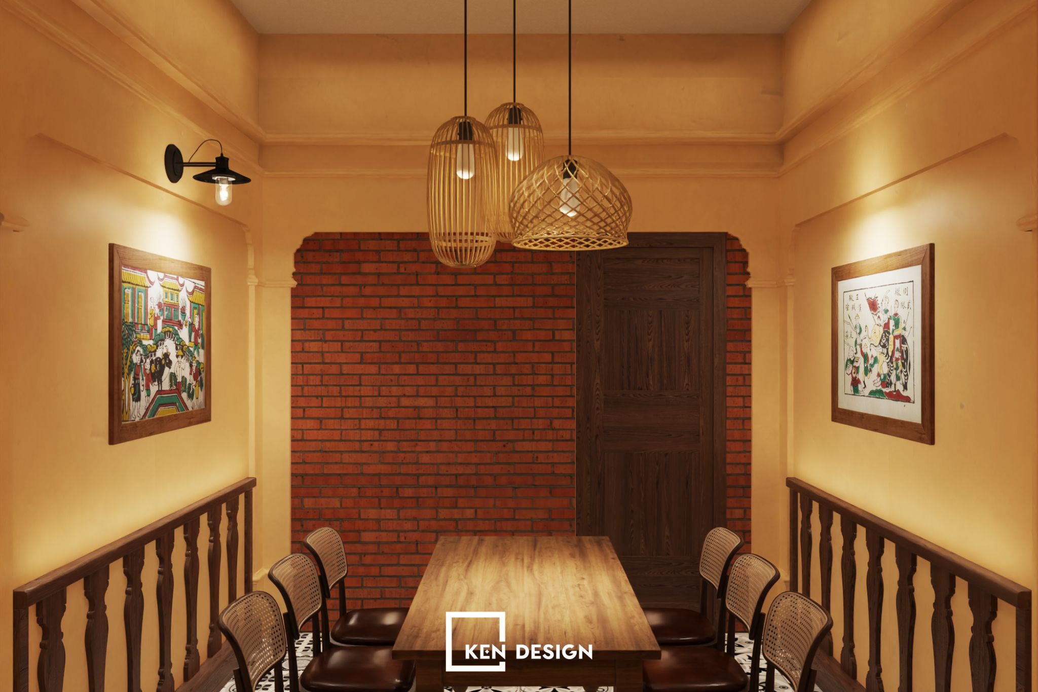
The most outstanding highlight that people see is none other than the traditional wind-blown flower tiles used in the design. The space is both modern and folk, fulfilling the desires of the investor. The fishing basket decor not only symbolizes the dishes served by the restaurant but also represents the genuine, simple, and beloved image of the Hai Mien Tay.
KenDesign - Professional Design and Construction Partner
Collaborating with KenDesign has transformed an old restaurant without space investment into a completely new space. Bringing the rustic countryside characteristics into an ideal space to enjoy natural and intimate countryside dishes.
Guiding and advising in building, designing, and completing the project is what KenDesign always desires, helping investors create restaurant and cafe spaces as they wish while ensuring a scientifically designed and cost-effective space for future operation. If you are planning to venture into the F&B industry, contact us for consultation and design. With years of experience and a dedicated team of staff and architects, we guarantee to provide the most creative and sophisticated design advice for your restaurant space.
