The desire of the Korean investor
Desires to incorporate the style of his homeland into the interior design of the milk tea shop. Thus, the investor aims to create a milk tea store that not only serves business purposes but also showcases the culture and beauty of Korea to the young Vietnamese generation, helping customers to better understand the cultural essence of the ginseng country."
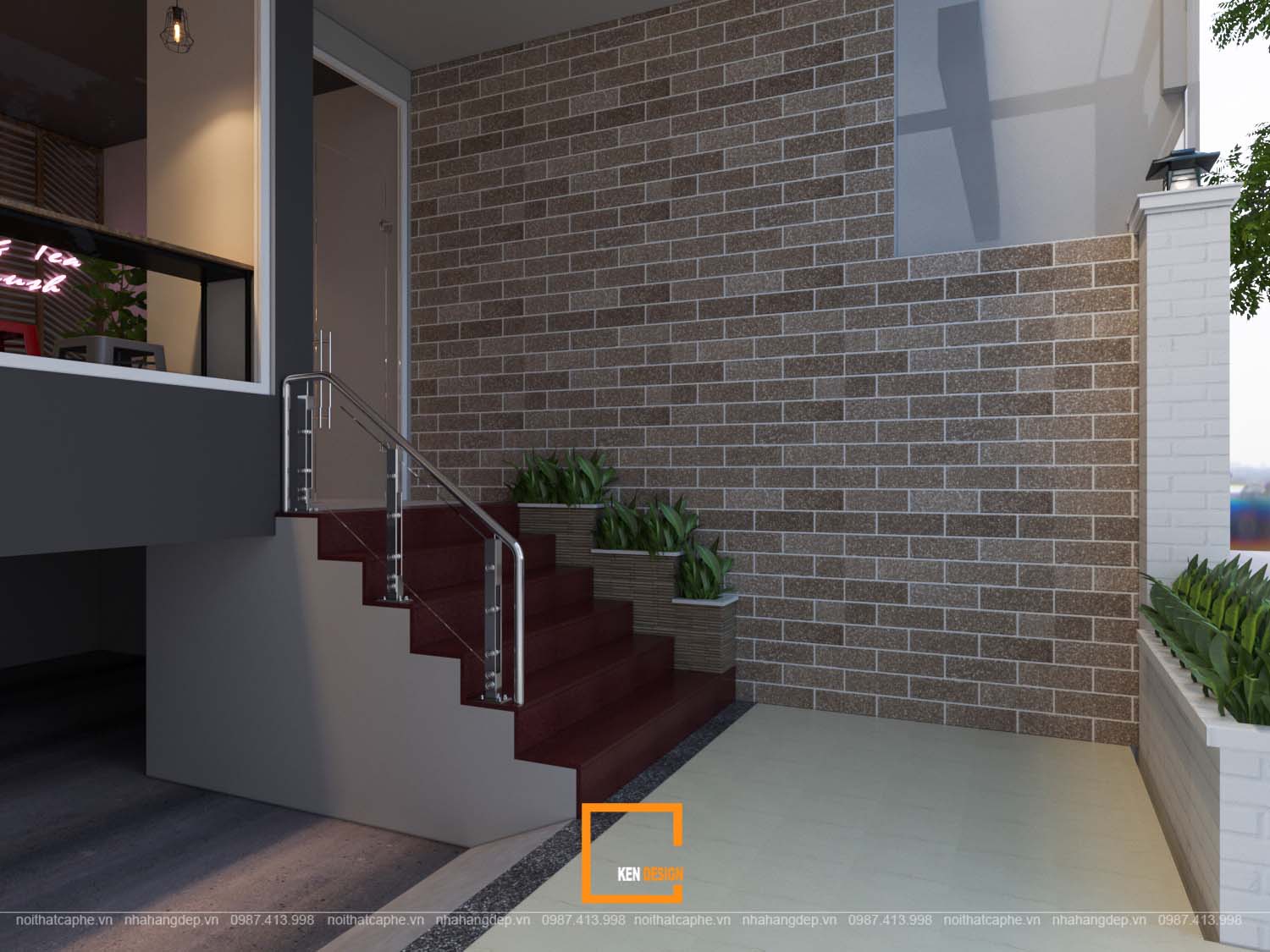
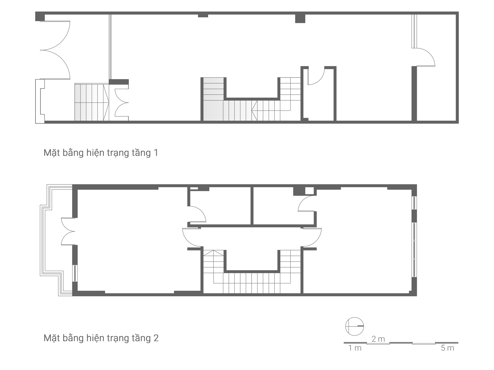
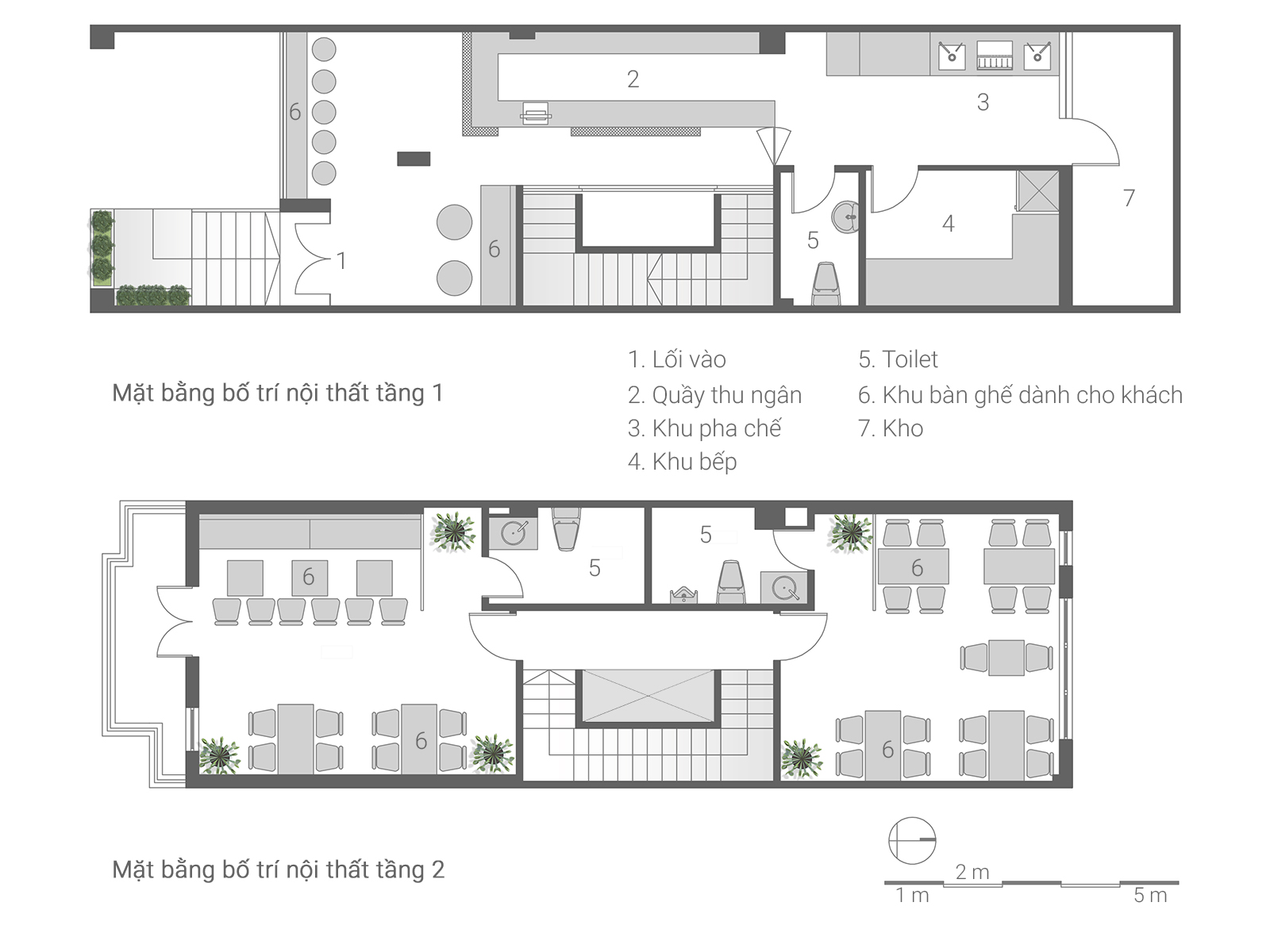
The current floor plan of this Ding Tea milk tea shop has a total area of 120m2 spread across two floors. It is not a small area, so the owner desires a well-designed and refreshing space that still showcases beauty, youthfulness, and modernity.
How did Kendesign transform Ding Tea?
Kendesign's design criteria are to be creative while prioritizing the needs of the owner. We have designed the space for Ding Tea on the mezzanine floor and the second floor of the building, with the basement reserved for parking. This interior design for the milk tea shop fully utilizes the floor area
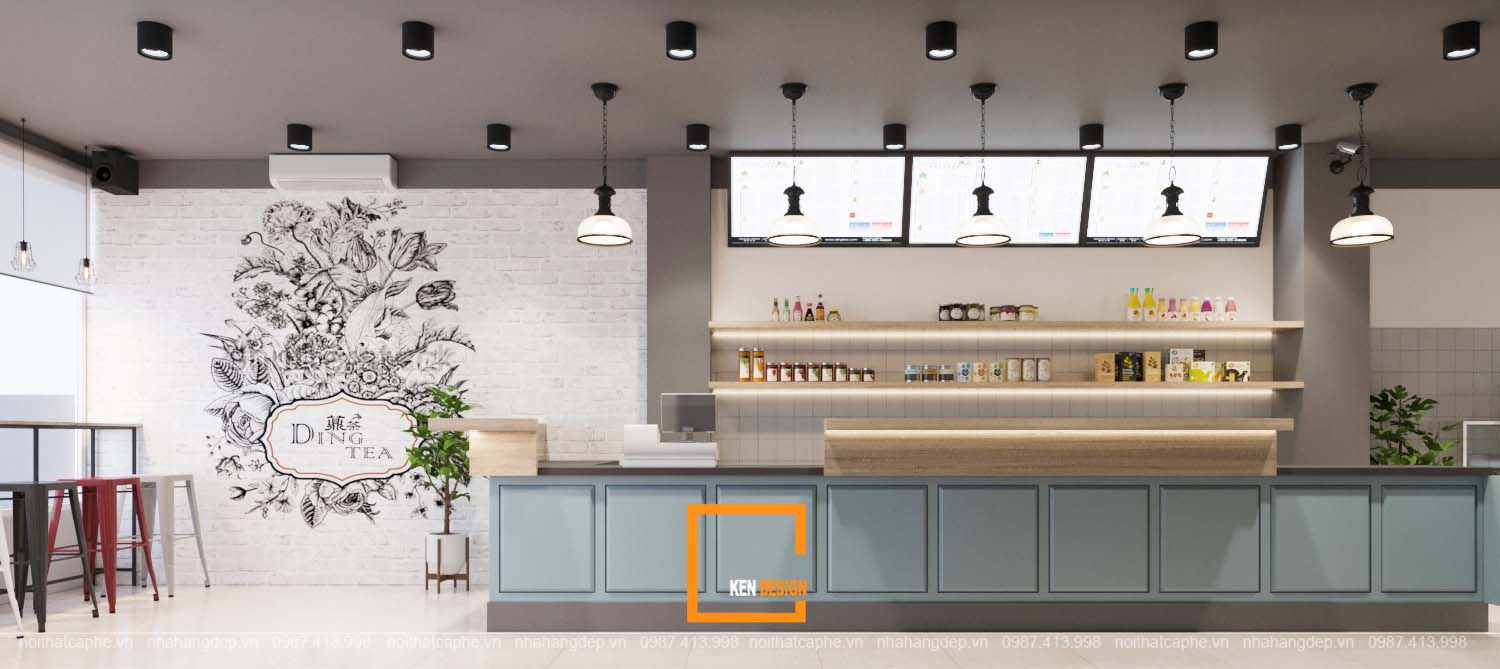
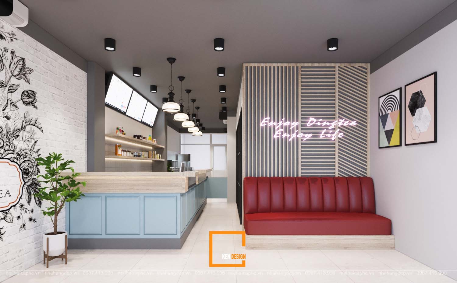
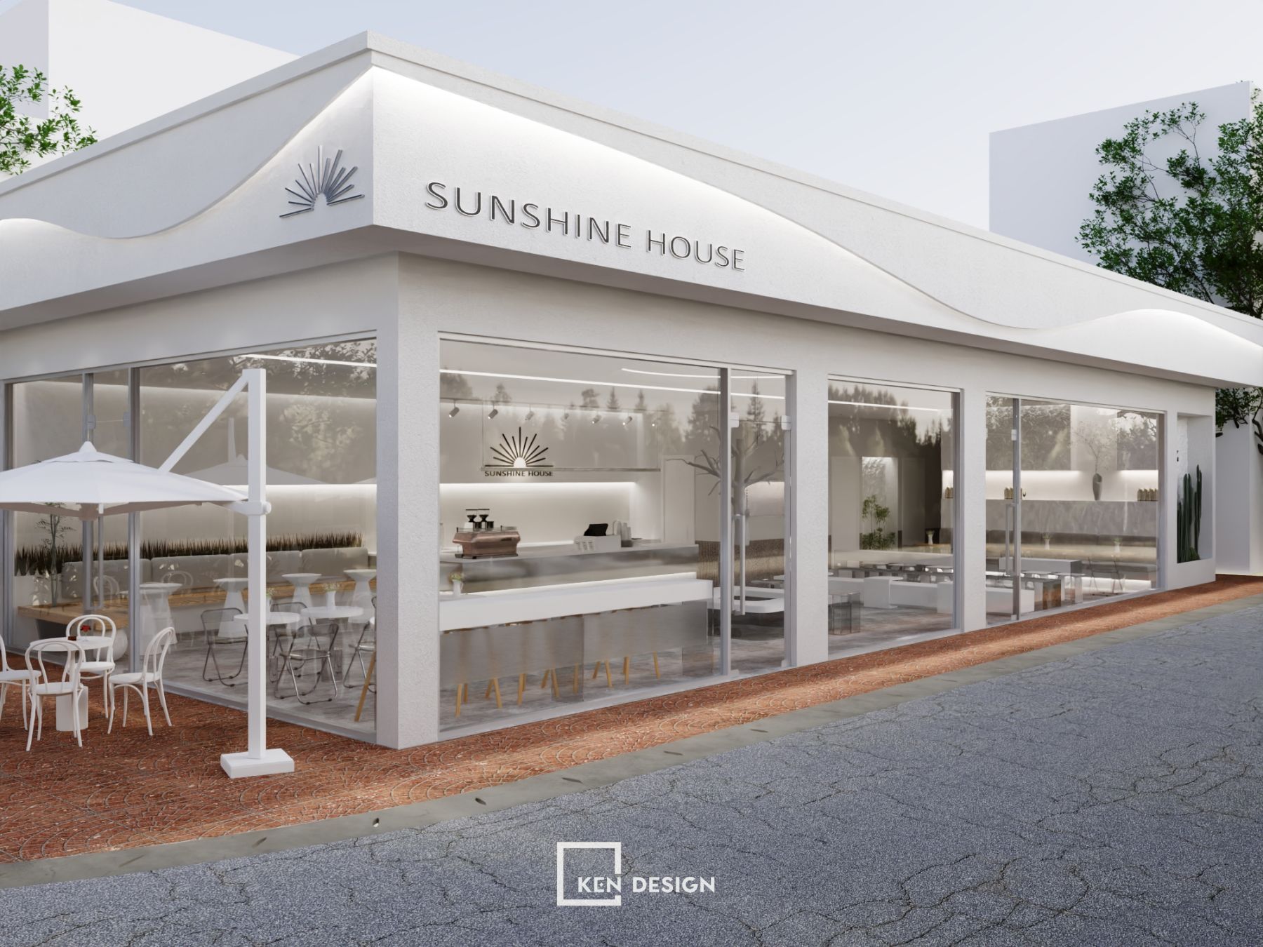
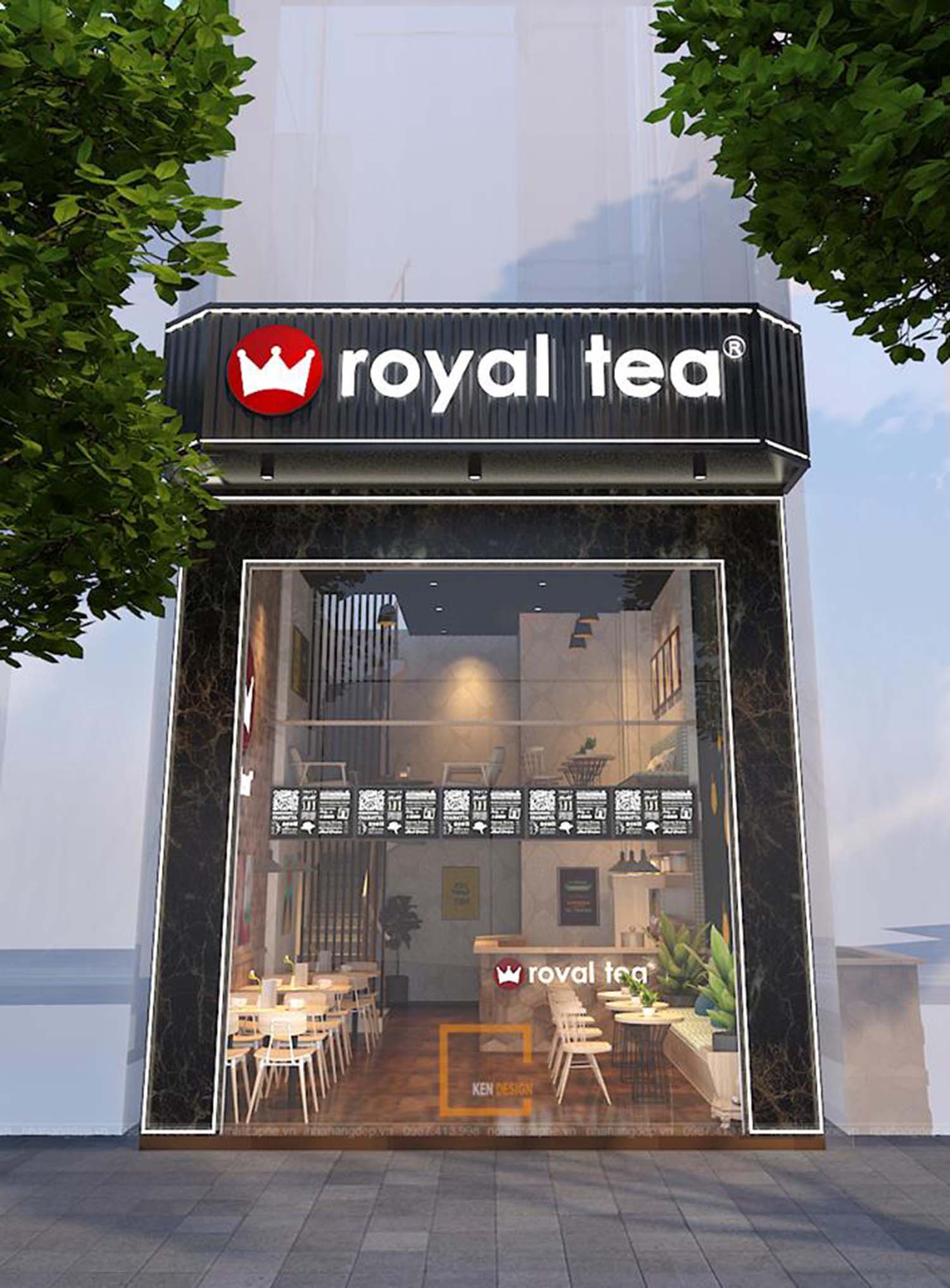
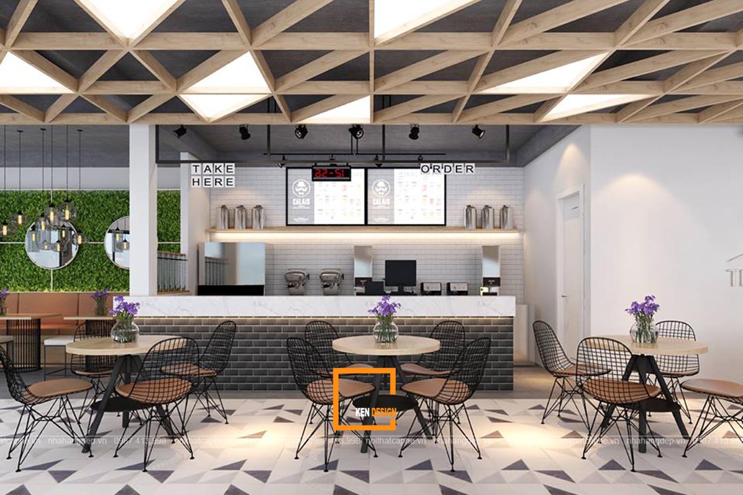
The shop entirely utilizes large glass panels on the storefront, allowing passersby to have a clear view of the interior while creating a spacious and airy ambiance. It also enables natural light to comfortably flood the space, providing customers with a pleasing environment.
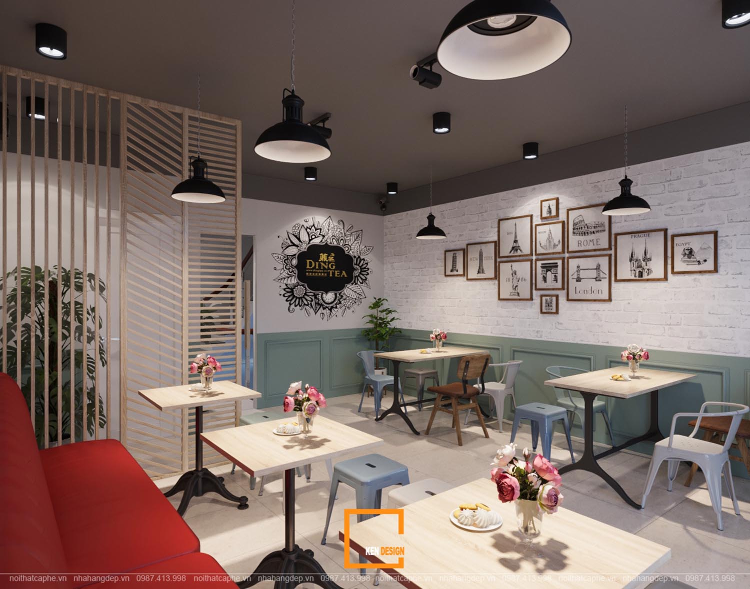
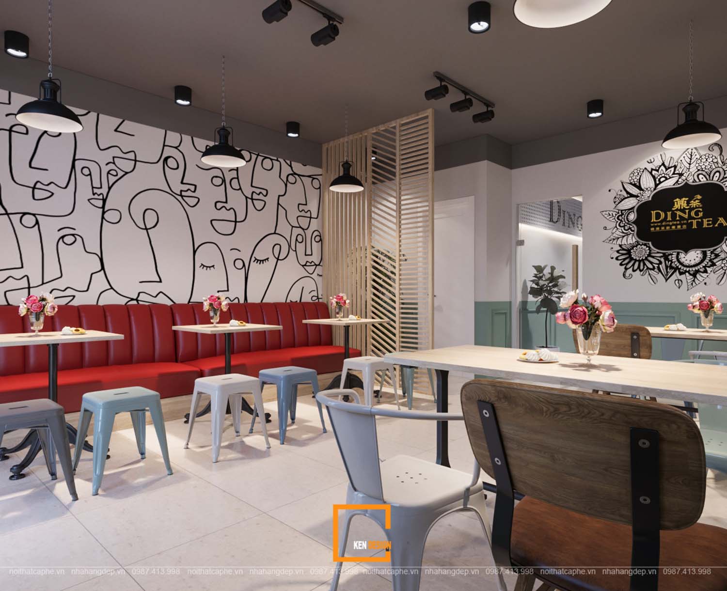
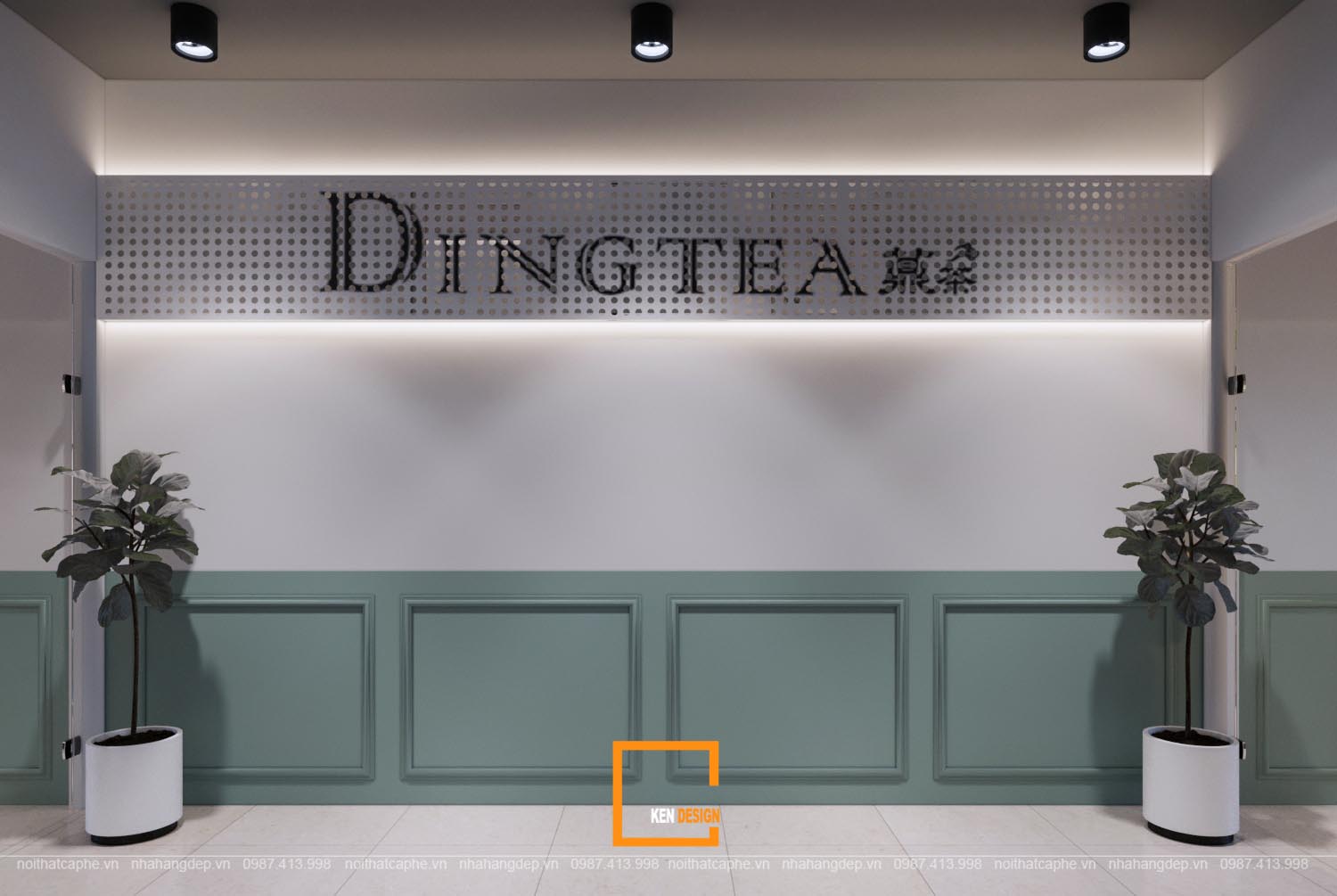
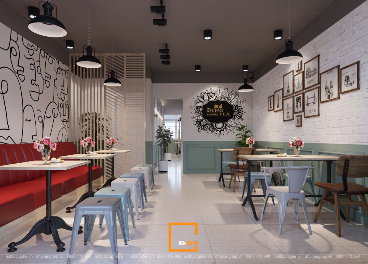
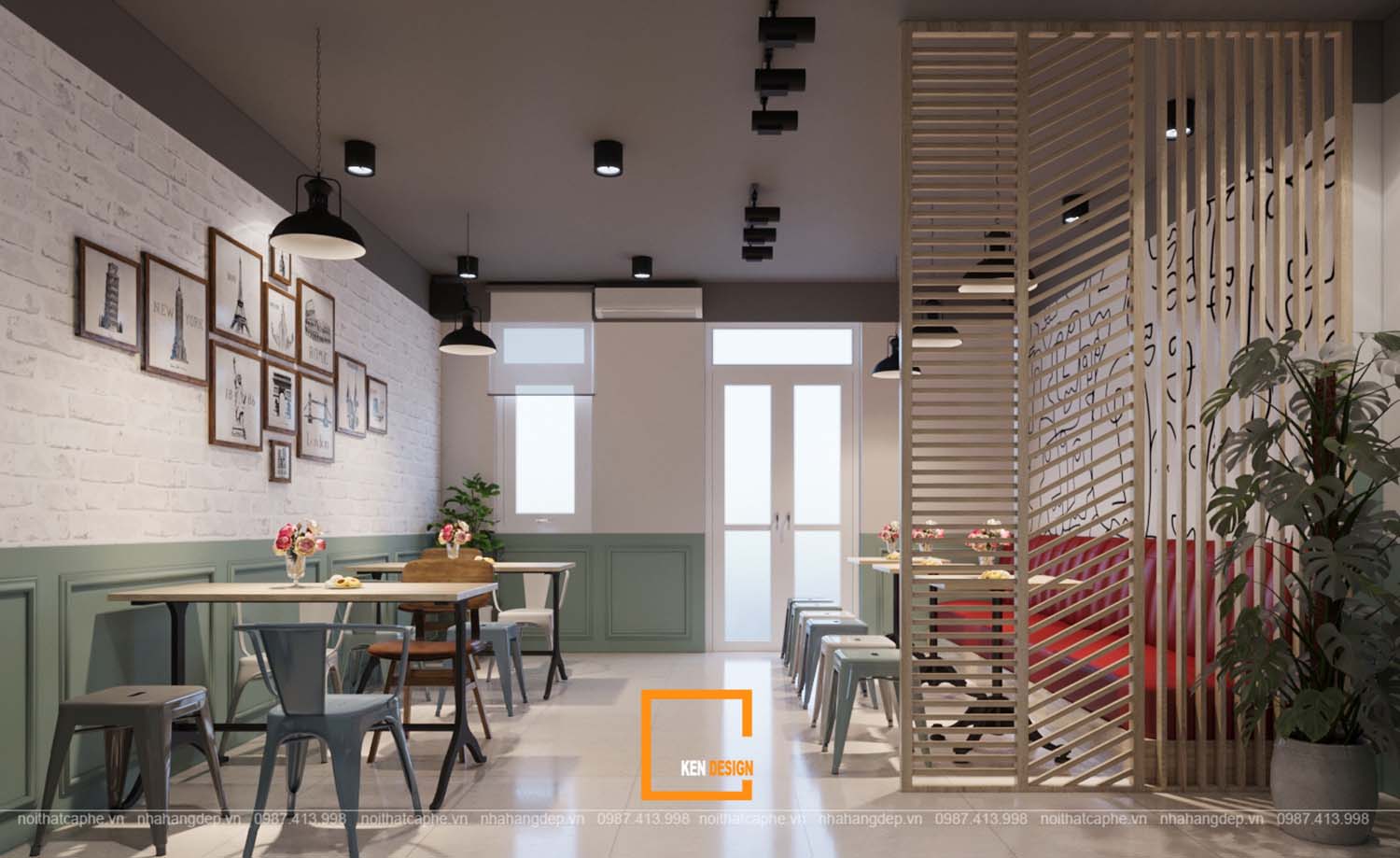
The walls and floors are adorned in a simple and unadorned white tone, giving the space an elegant and open feel. Additionally, we accentuated the white walls by adding a decorative touch with a green emerald color, painting 1/3 of the wall, which gives the café a fresh and tranquil atmosphere.
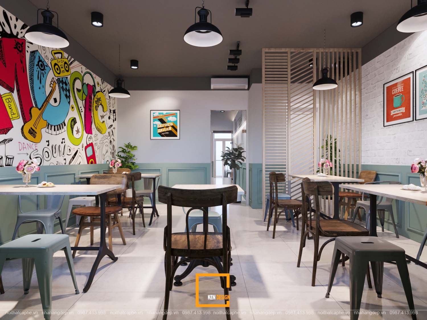
The furniture of Ding Tea
The furniture including the chairs and tables, come in a variety of colors, styles, and materials, but they still harmonize with the space and maintain the modern and elegant ambiance in the interior design of Ding Tea. The diverse selection of chairs and tables not only varies in style and material but also has been strategically arranged to ensure a professional and flexible space for operations.
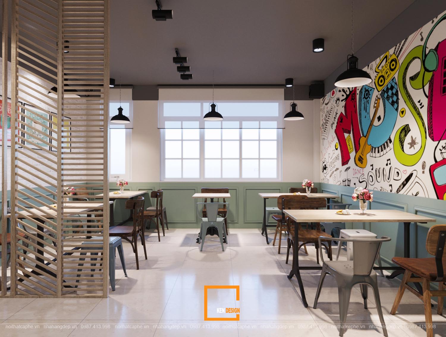
One distinctive feature of the Korean interior design that Kendesign incorporated, which greatly pleased the investor, is the use of conventionally partitioned spatial structures. This highlights the ideas and desires of the investor and also brings a rare uniqueness to the spaces of the tea shops.
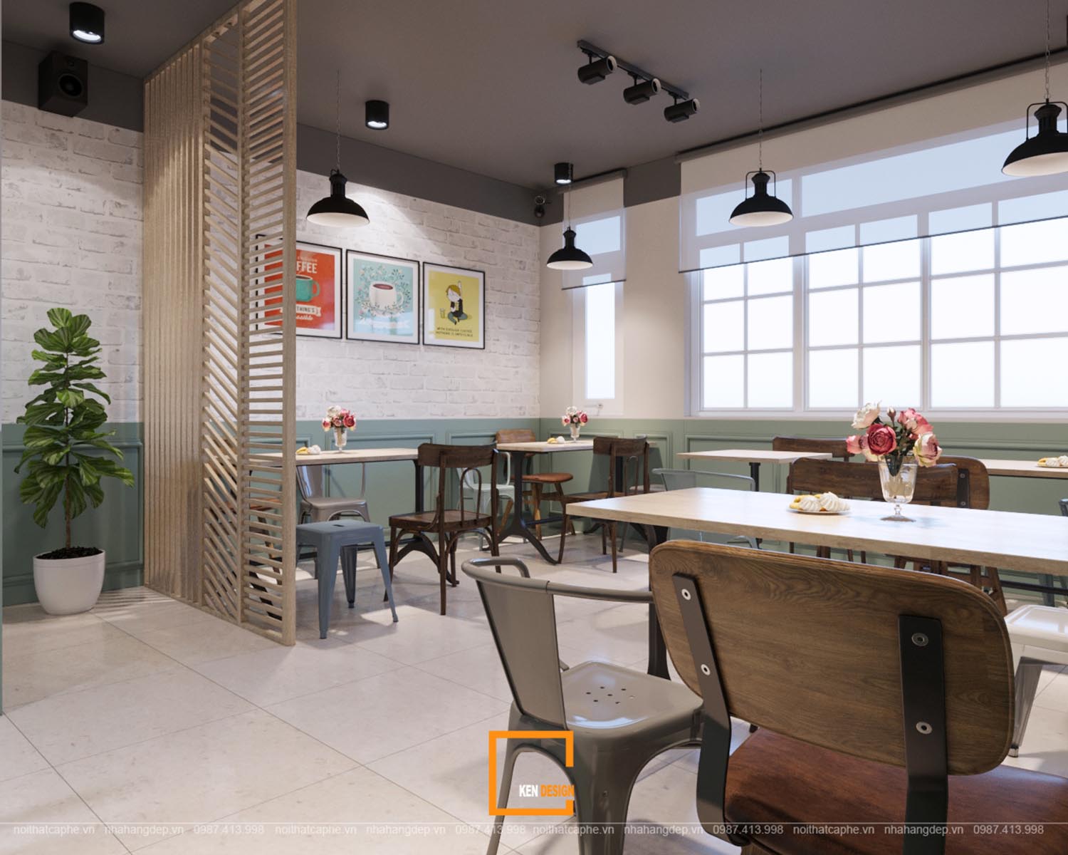
The wall paintings are cleverly and appropriately arranged to create focal points, elegantly dividing the space and making it organized and airy. In addition, the clearly defined areas are separated by simple and refined partition walls with horizontal and vertical wooden bars, allowing for openness between the two areas while still maintaining separation.
