The Rosier store chain has been accompanying the architects at Ken Design since its first establishment, remaining loyal to the Minimalism design style. With the upcoming Rosier Nguyen Nhu Uyen design, the architecture team at Ken Design has closely adhered to the desires of the investors and faithfully followed the original design style to create a minimalist masterpiece with unforgettable highlights.
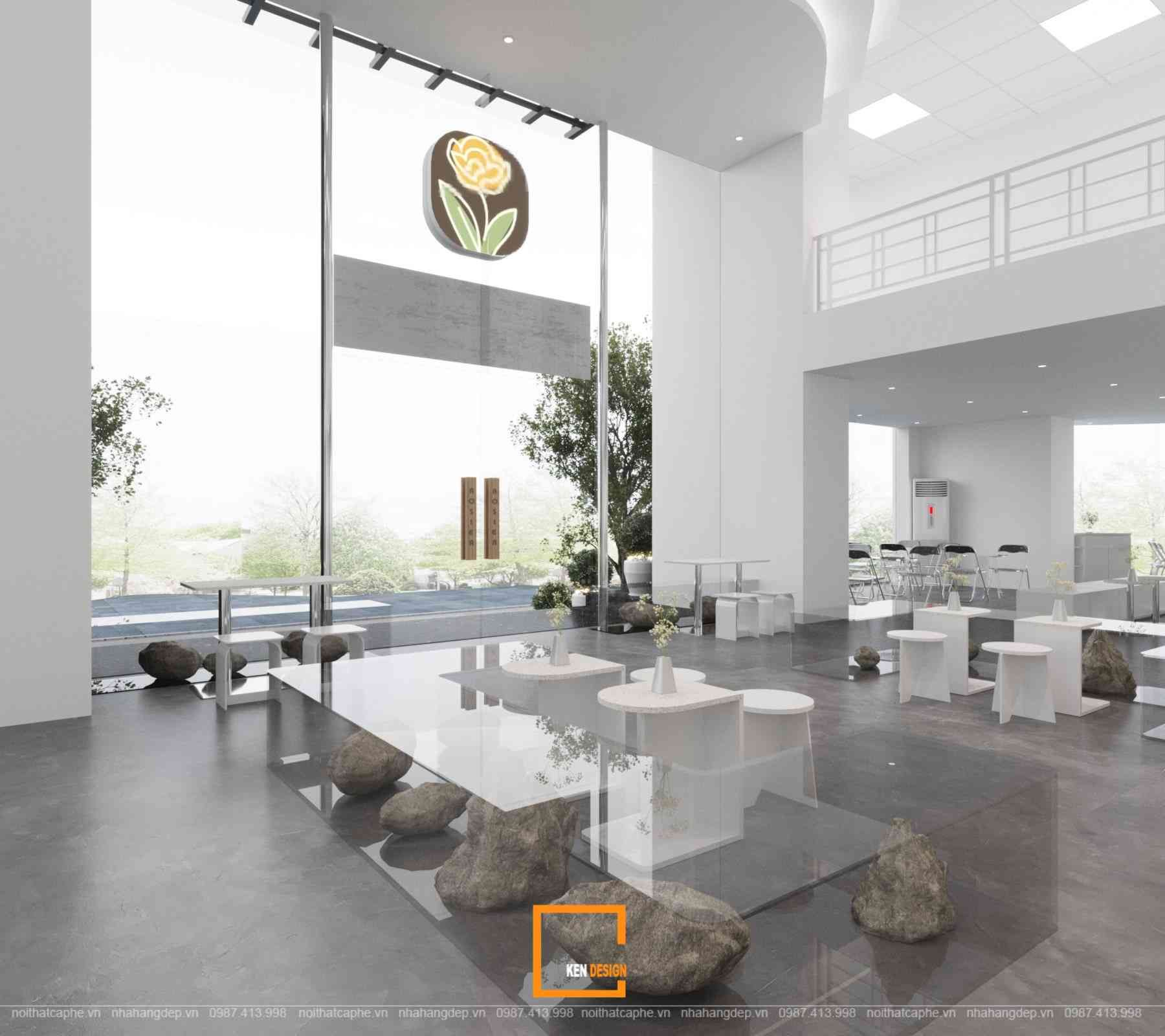
Rosier Nguyen Nhu Uyen Design Direction
Rosier is a cafe chain that follows a minimalist, uncluttered, and unpretentious design approach. The design direction and objective of Rosier Nguyen Nhu Uyen is to create beauty from harmonious and symmetrical details, all while maintaining a light and gentle ambiance.
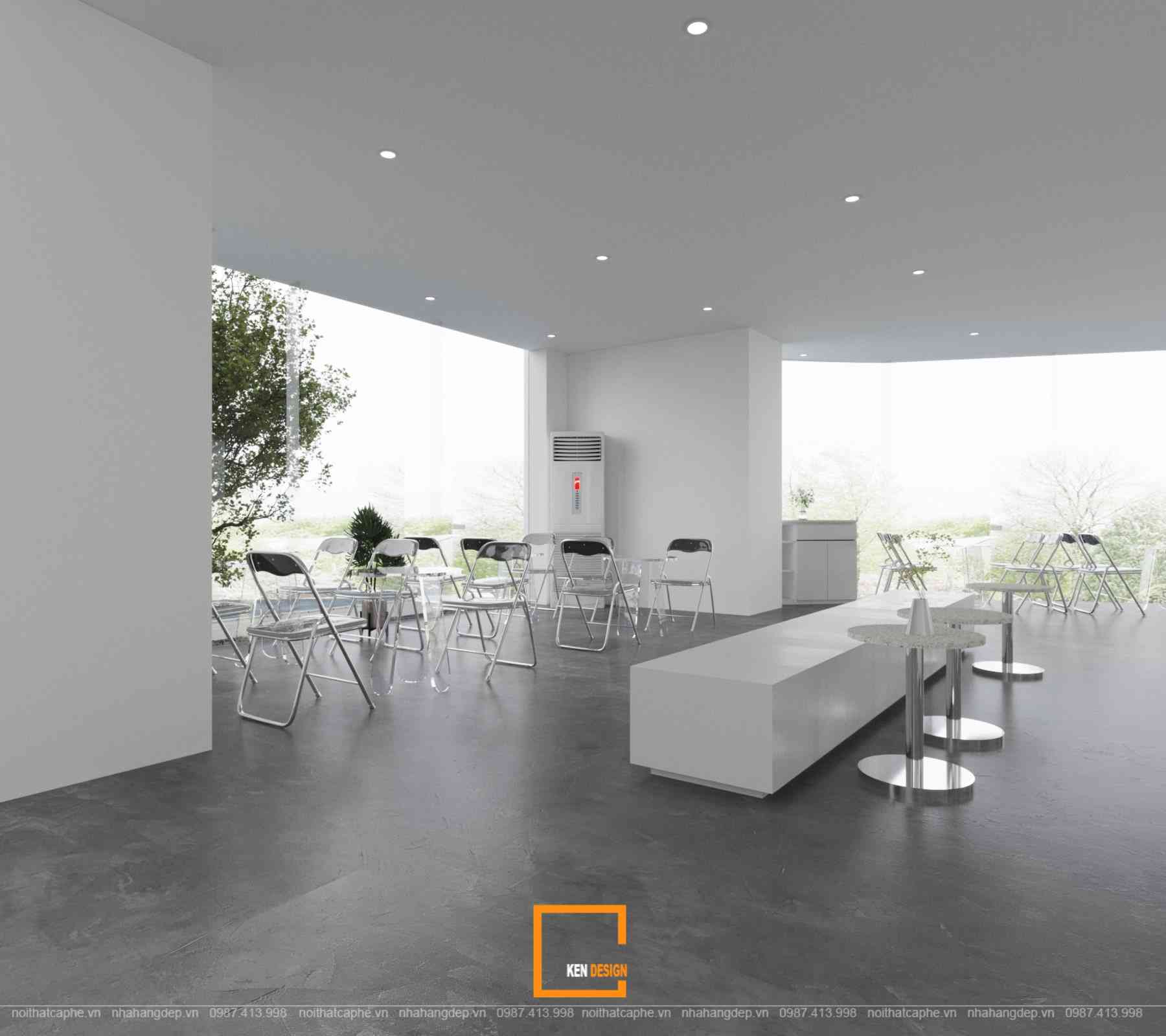
Simple yet not monotonous, Rosier Nguyen Nhu Uyen aims to build spaces filled with natural light and a truly airy atmosphere. In minimalist architecture, natural light is a crucial aesthetic element through the most important viewpoint. With a predominant bright white tone, Rosier creates an impressive sense of openness, making the overall layout of the project appear even more elevated and elegant.
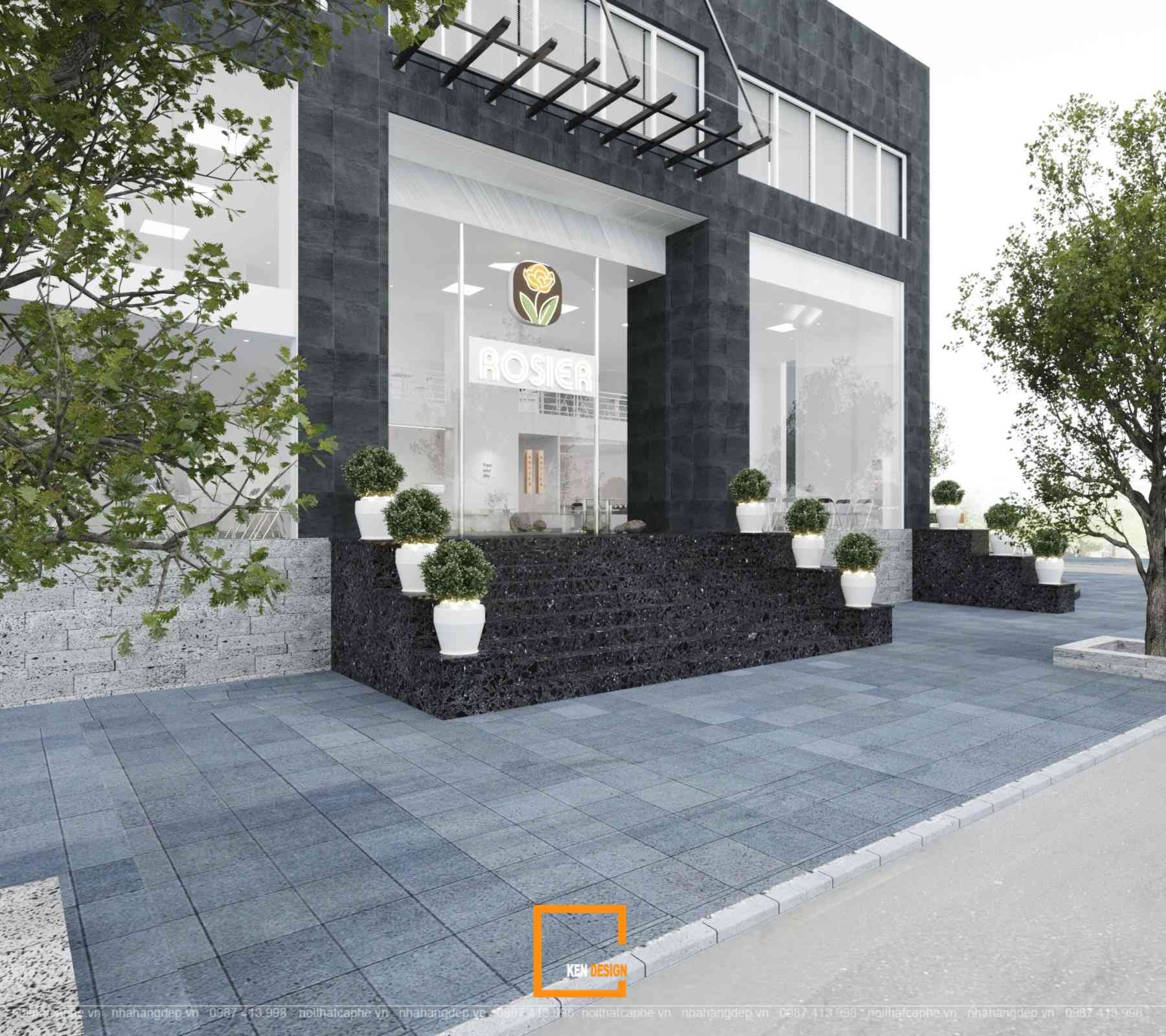
Explore the Exterior of Rosier Nguyen Nhu Uyen
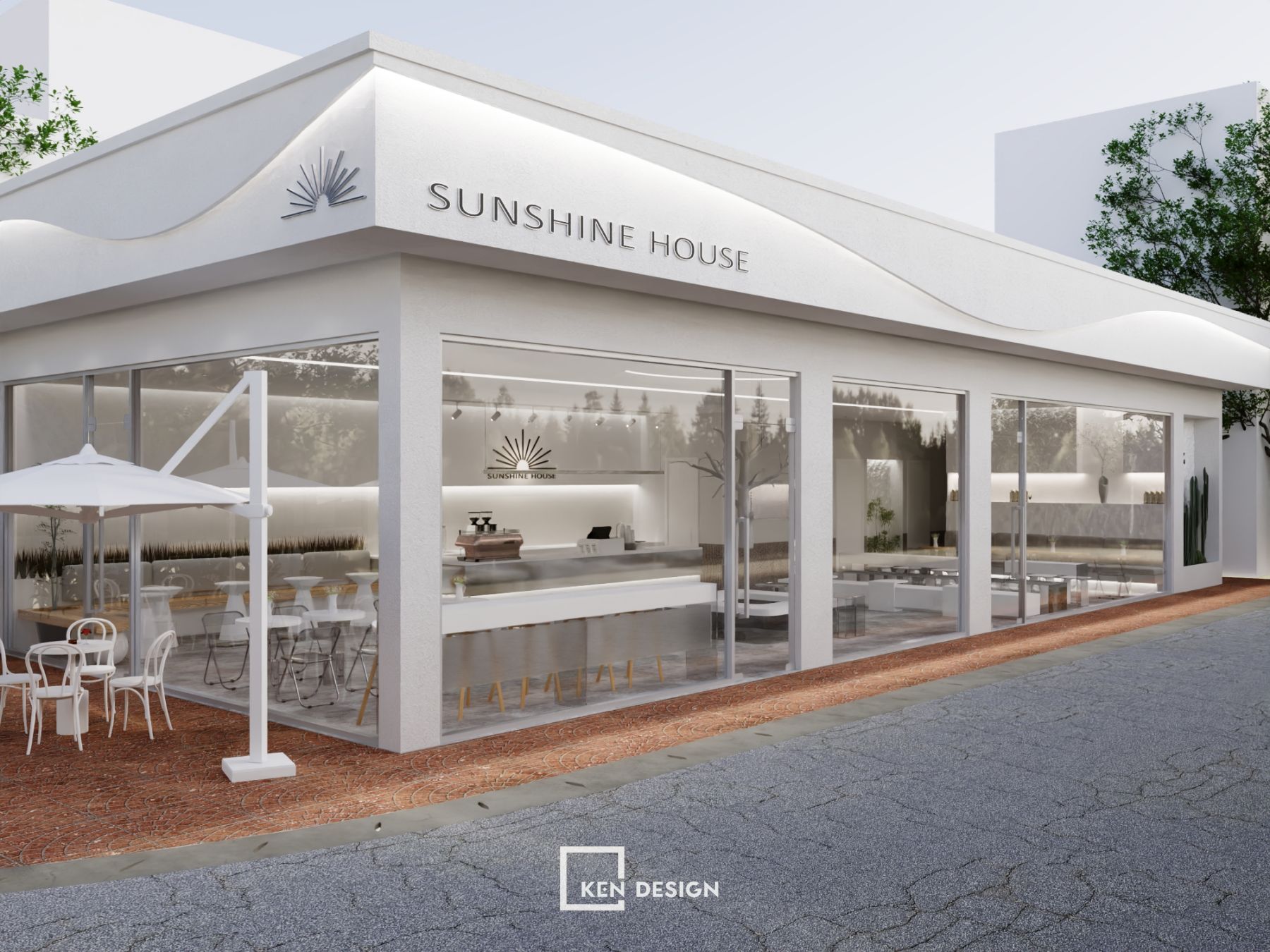
From the outside, the design of Rosier Nguyen Nhu Uyen showcases its elegance and sophistication throughout the entire shop. With expansive glass panels on three sides, the interior view will be fully visible, creating a sense of openness and spaciousness that is very appealing to customers.
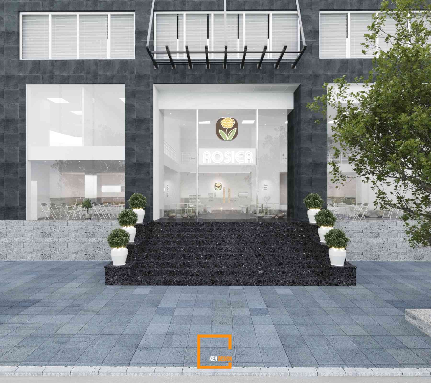
The architects at Ken Design proposed a solution to elevate the brand by strategically placing the logo and brand signage right at the center of the main entrance. The staircases leading into the shop are also adorned with balanced and symmetrical green planters. This design concept, seemingly simple yet highly effective, brings a feeling of utmost comfort and relaxation to customers even before stepping foot inside the shop.
Explore the Interior of Rosier Nguyen Nhu Uyen
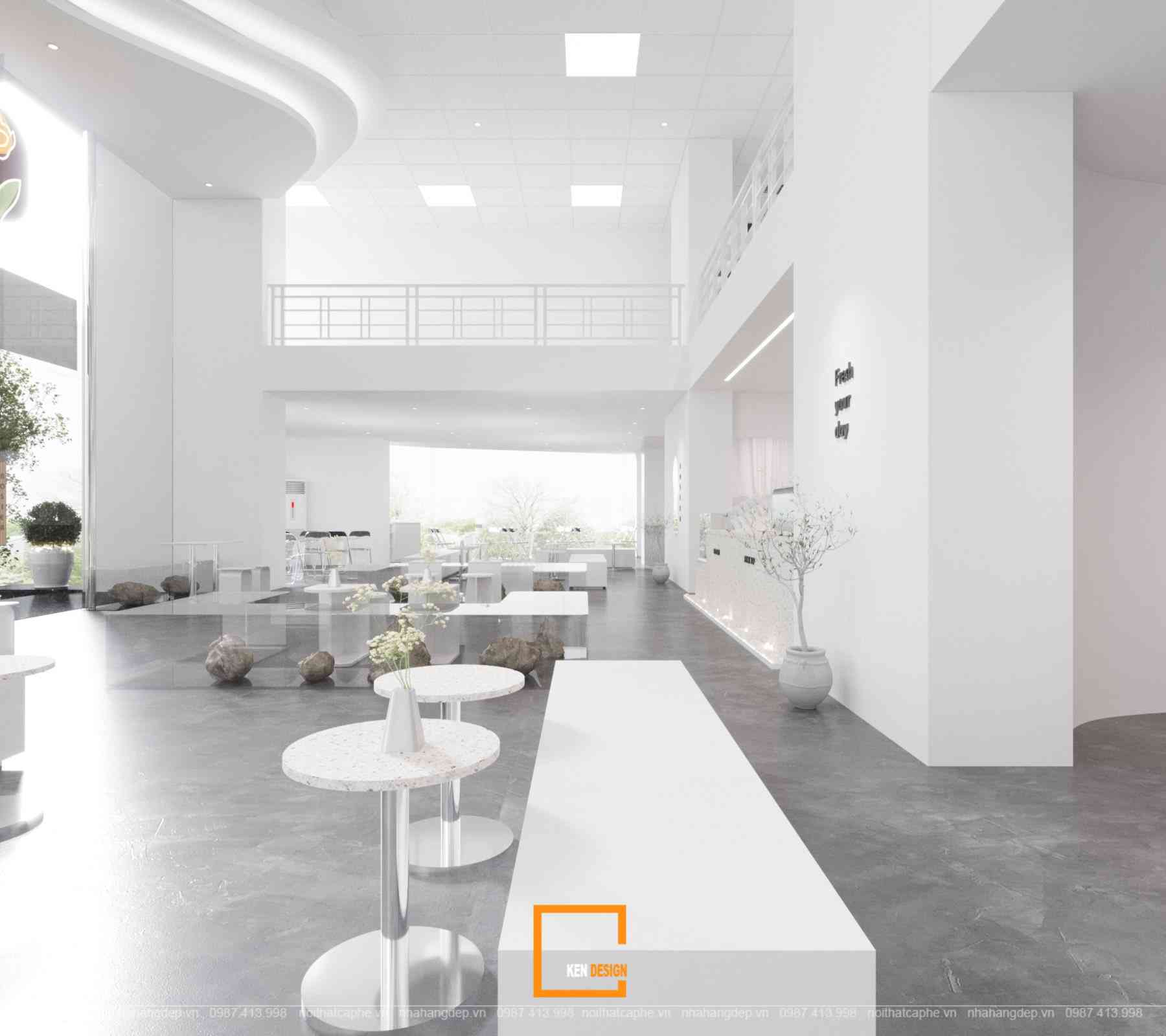
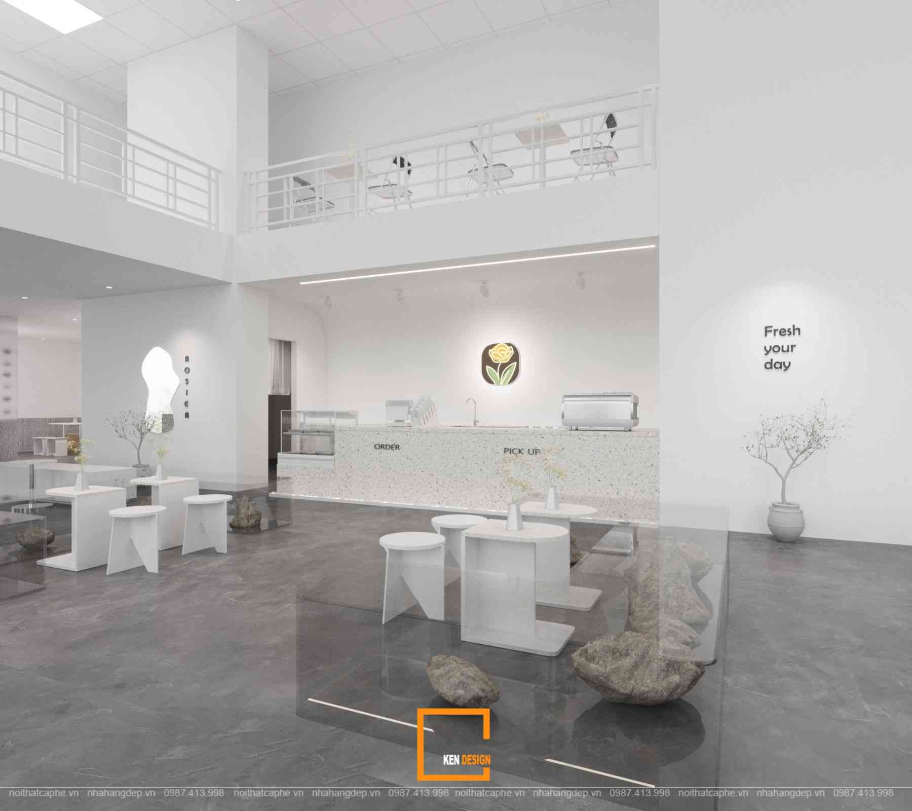
Upon stepping inside, customers will be amazed by the open and spacious two-story layout, the abundant natural light, and the elegant white tone dominating the entire design of Rosier Nguyen Nhu Uyen. The design of the shop aims to cater to the entertainment and "Instagrammable" needs. Therefore, each space is meticulously arranged, carefully considering the placement of decorative furniture to ensure that customers can capture beautiful pictures from every angle.
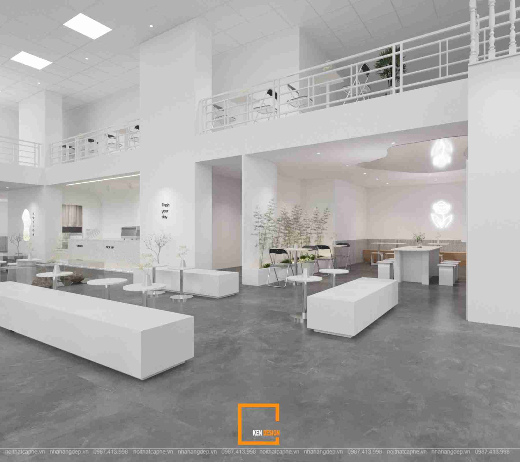

Ken Design arranges each seating space to ensure spaciousness and openness. There are clear pathways between the table and chair sets to enhance the sense of openness for visual perception. Additionally, the use of diverse and non-uniform table and chair sets creates a flexible ambiance, catering to the individual needs of customers while also accommodating group gatherings.
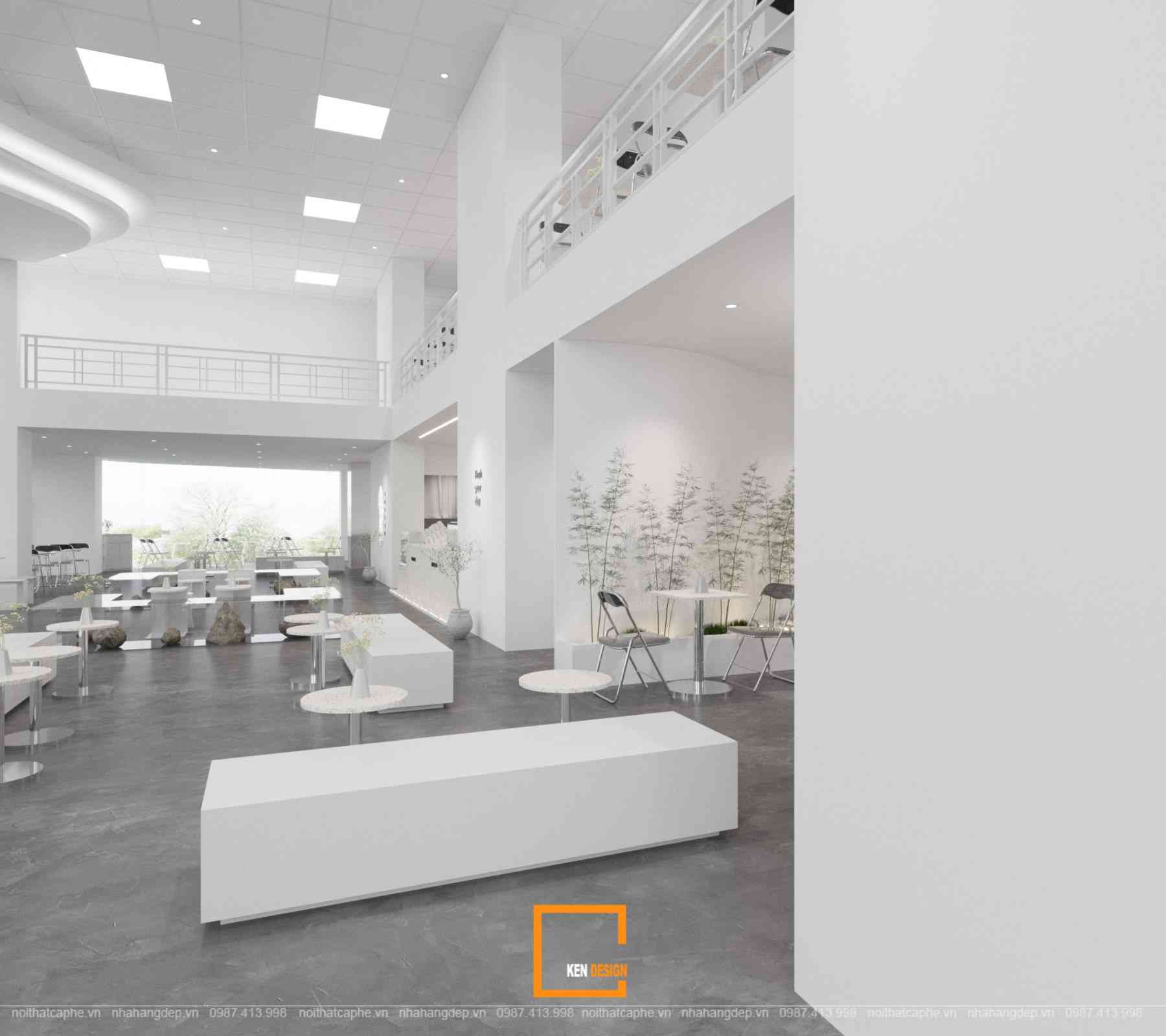
The outstanding highlight of Rosier Nguyen Nhu Uyen
The interior space of Rosier Nguyen Nhu Uyen is adorned with numerous small potted plants placed intermittently for decoration, creating a sense of freshness and delicacy that perfectly complements the minimalist and simplistic style of design.
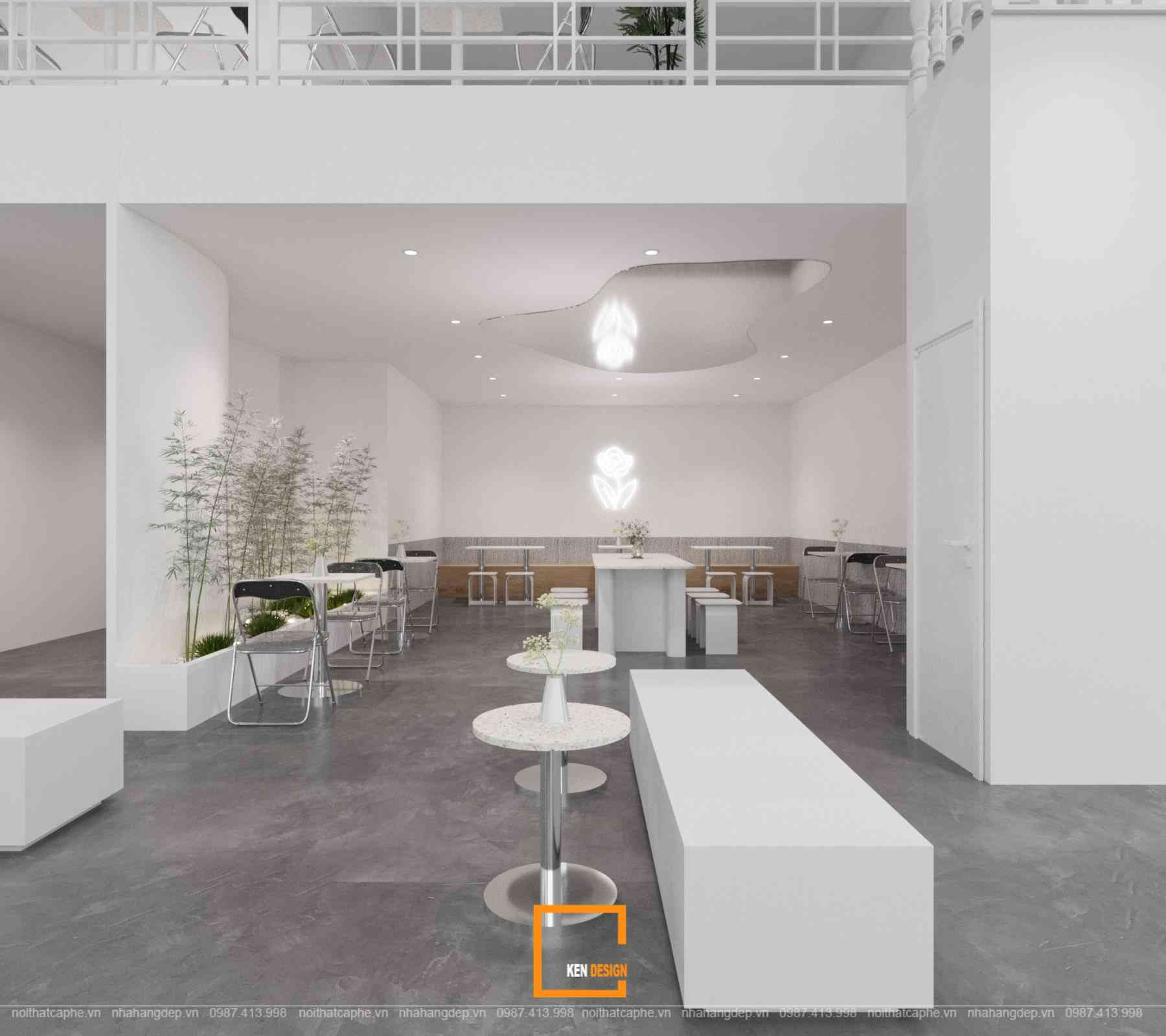
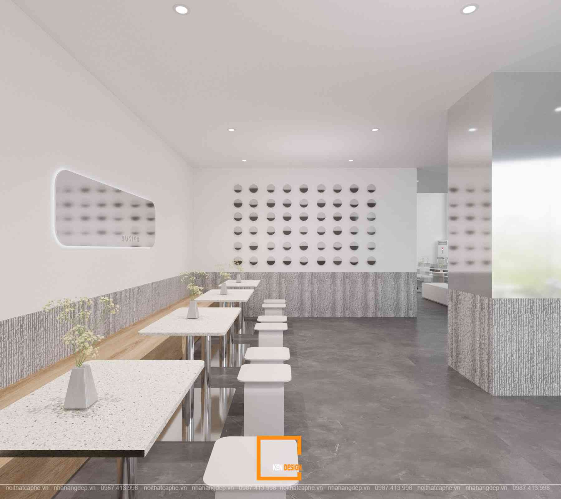
The most outstanding and unique highlight in the minimalist space is the mirror attached to the ceiling - one of the most sophisticated "artistic touches" created by the experts at Ken Design. This eye-catching "2 in 1" design not only adds a special accent but also extends the height of the space.
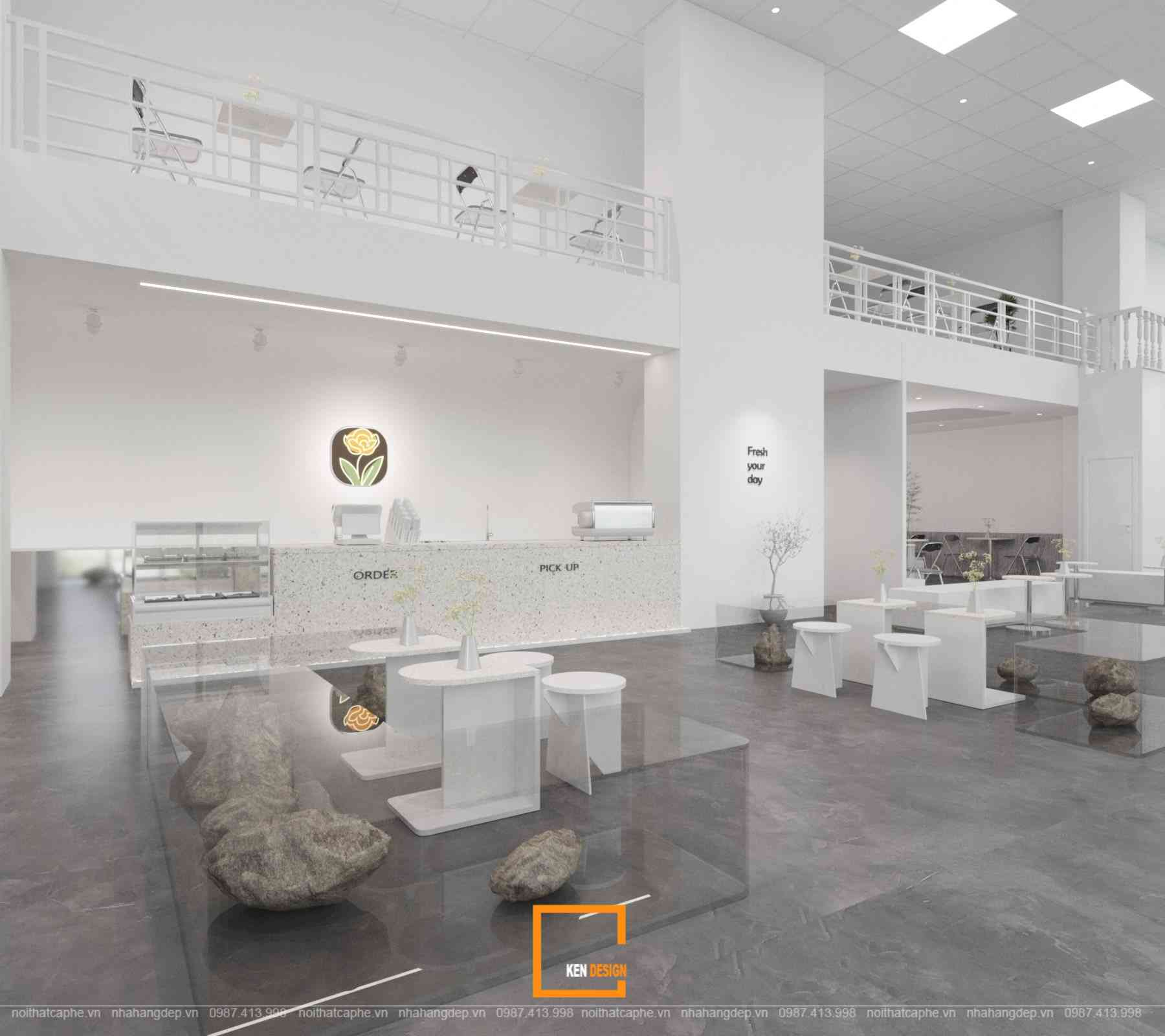
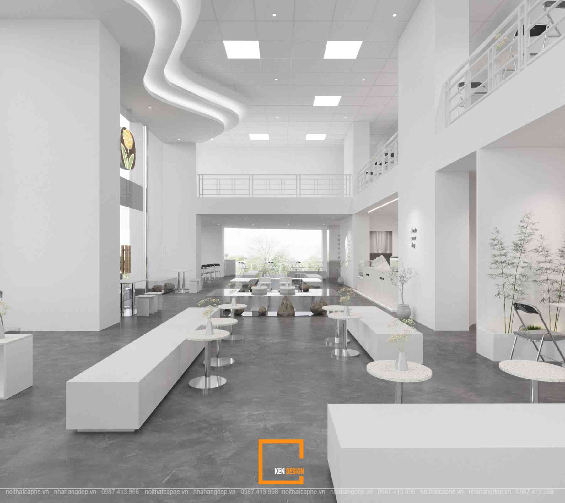
Thanks to the frosted stainless steel mirror material arranged around the seating areas, combined with glass panels, it enhances the sense of openness for the entire space, creating a feeling of utmost relaxation and comfort for those gentle and soothing moments at Rosier Nguyen Nhu Uyen.
The Lighting System of Rosier Nguyen Nhu Uyen
Starting with the vision of creating a space for a trendy and entertaining café experience, the design of Rosier Nguyen Nhu Uyen incorporates a highly intelligent and thoughtful lighting system to ensure that every corner shines brightly. The walls featuring the logo, brand name, and quotes/slogans are adorned with additional LED lights, creating a sophisticated and eye-catching appearance.
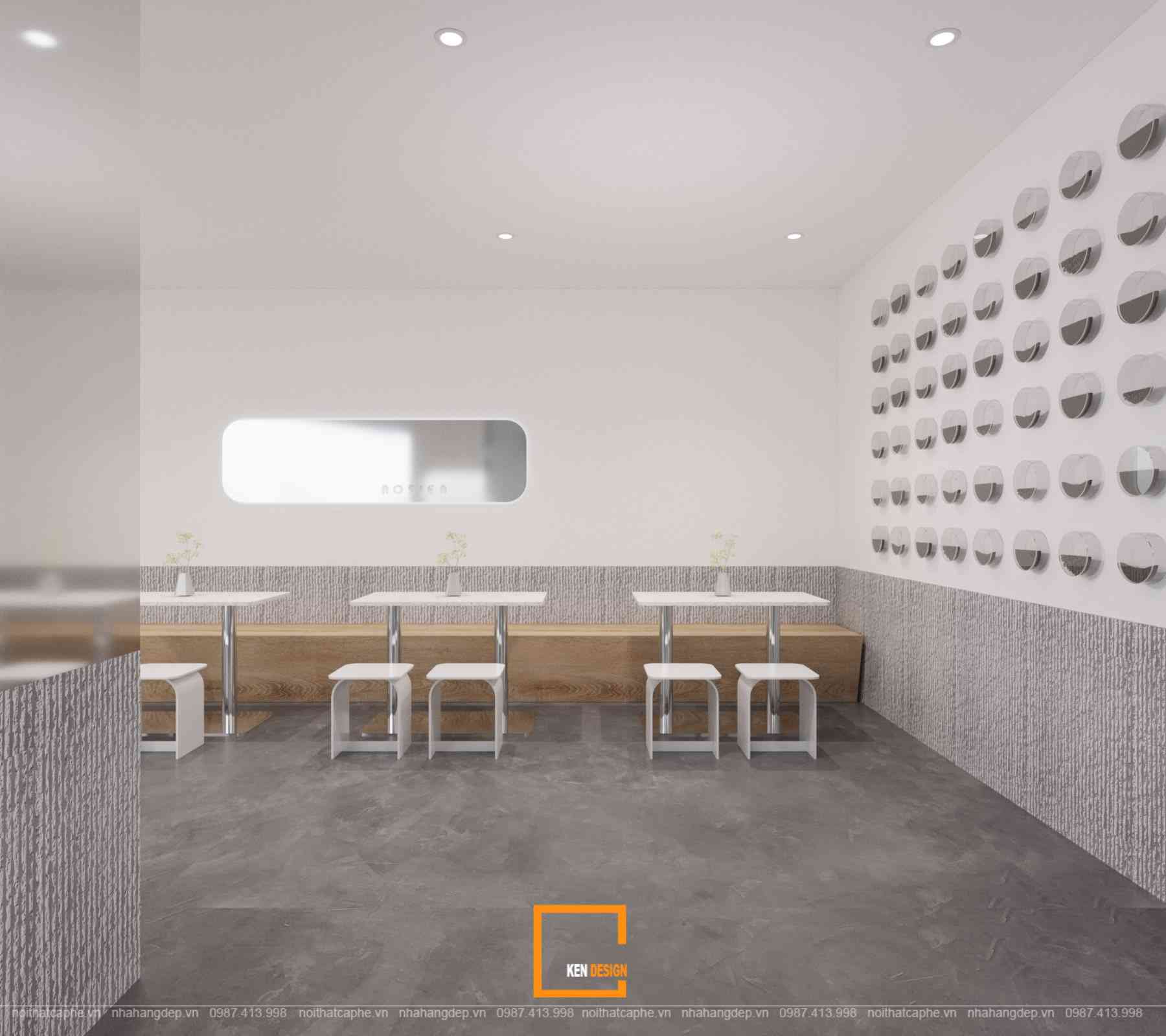
The design of Rosier Nguyen Nhu Uyen brings a sense of sophistication, lightness, and innovation right in the midst of the most minimalist space. Investors can refer to other coffee shop design samples and do not hesitate to contact the team of experts at Ken Design for consultation
